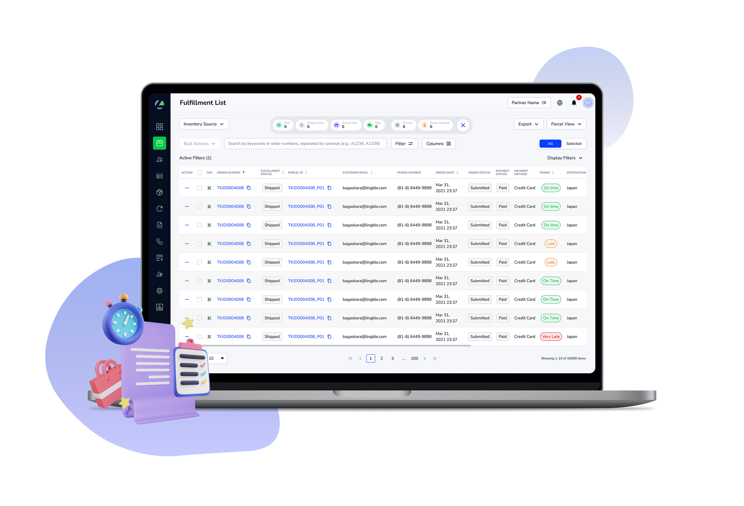
Lingble: Refining fulfillment workflows in an e-commerce platform
2024 - 2025My Role
Lead Product Designer,
Research Strategy & Planning,
Cross-team Feature Planning
Lead Product Designer,
Research Strategy & Planning,
Cross-team Feature Planning
Platforms
Web App
Web App
Team
3 Product Designers
2 Product Owners,
20+ Engineers
3 Product Designers
2 Product Owners,
20+ Engineers
Confidentiality Disclaimer: This case study focuses on the key problems and design decisions, but not every detail of the listed projects. If we have the opportunity to speak personally, I’d be happy to walk through more of the work within the NDA boundaries.
Background
Lingble is a global e-commerce solutions company that helps brands expand internationally while offering localized shopping experiences. It provides end-to-end services, including website development, logistics, localized payments, customer support, and marketing.
When I joined Lingble, the product had all fundamental features and was moving quickly. But like many startups, speed came at the cost of refinement. Features worked but weren’t always user-friendly. The UI components were inconsistent across the pages because there was no complete Design System. Within the design team, we faced some problems such as tasks tracking and communication with the stakeholders.
The company expected me to bring structure: improve product experience, raise design quality, and guide the team toward more efficient ways of working.
As Lead Product Designer, I guided the design team while also working hands-on to improve the product. My main projects included:
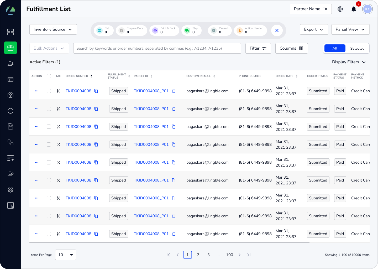 Lingble Link
Enhancing the overall fulfillment experience in the platform
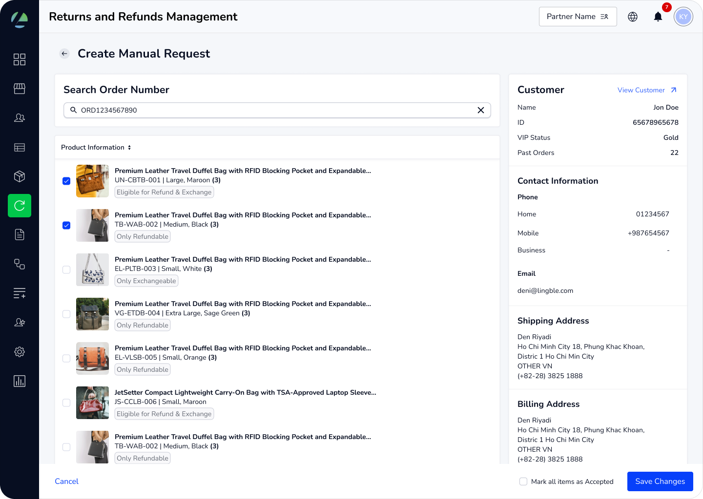
Return Merchandise Authorization
Designing the return/refund process inside Lingble Link
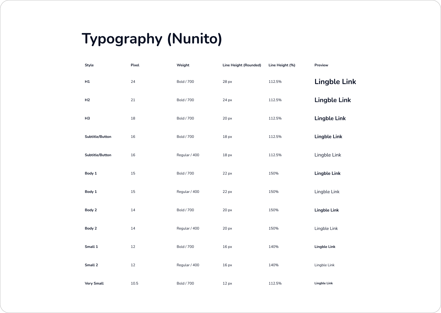
Lingble Link Design System
Creating a consistent and scalable design system for Lingble Link
Problem Statements
I spent the first two weeks at Lingble learning how the team worked, studying the product, reviewing user manuals, and going through past research and surveys. This helped me get a clear picture of the situation and the problems that needed solving:
#1. Unclear priorities and fragmented workflows
Lingble Link, the fulfillment management platform, had foundations but lacked clear prioritization and workflow streamlining. Common tasks like tracking orders, updating inventory, or updating product data lacked clear prioritization in the product design. Without streamlined workflows, users often had to take extra steps or switch between pages to complete basic tasks, which slowed them down and made daily operations more frustrating.Example of high-level fulfillment flow: Users frequently need to switch between these three pages to fulfill an order:

#2. Inconsistent UI and misalignment between design and production
On top of this, the UI was inconsistent. Different pages used different components and styles, and there were gaps between design and production. This not only made the experience confusing and less polished for users, but also made it harder for the design team to maintain design files and for the QA team to test the UI. For engineering, these inconsistencies created extra work, as similar components had to be rebuilt multiple times in slightly different ways.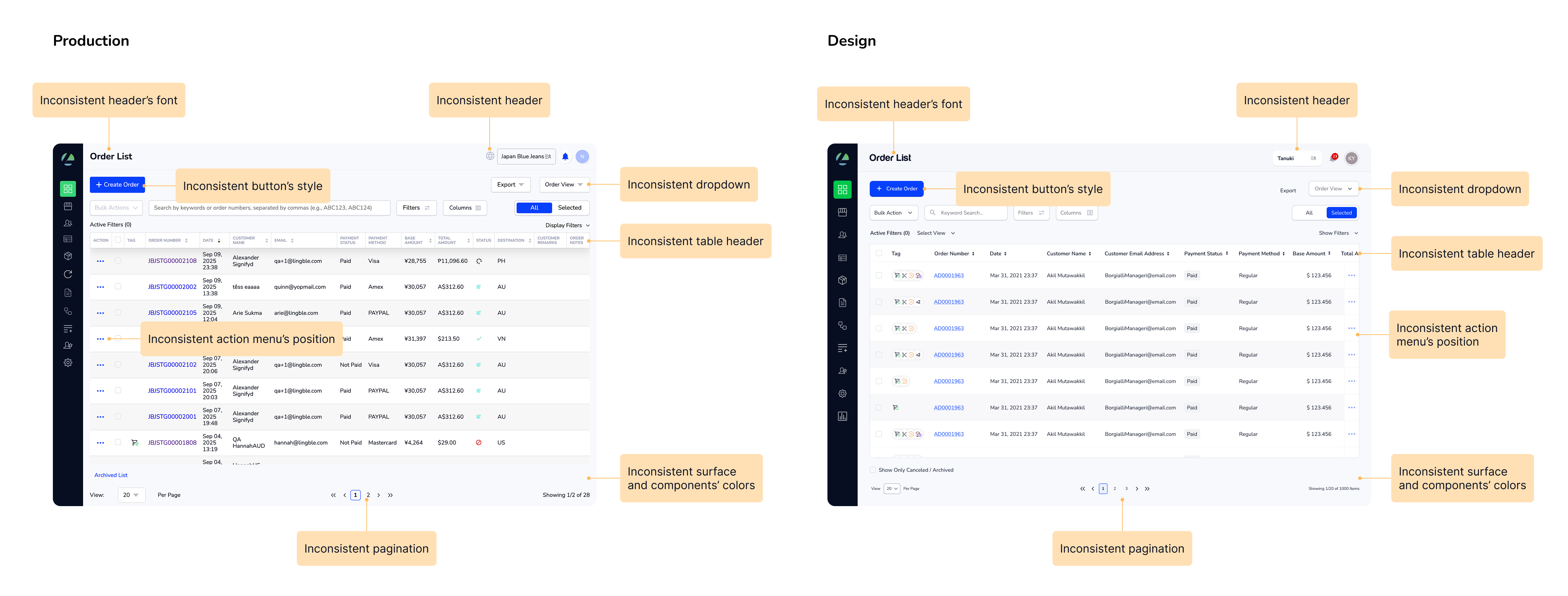
#3. Team workload and time management issues
Inside the design team, things weren’t easier. With multiple workstreams and tight deadlines, the design team struggled with workload management, communication, and keeping the design quality consistent.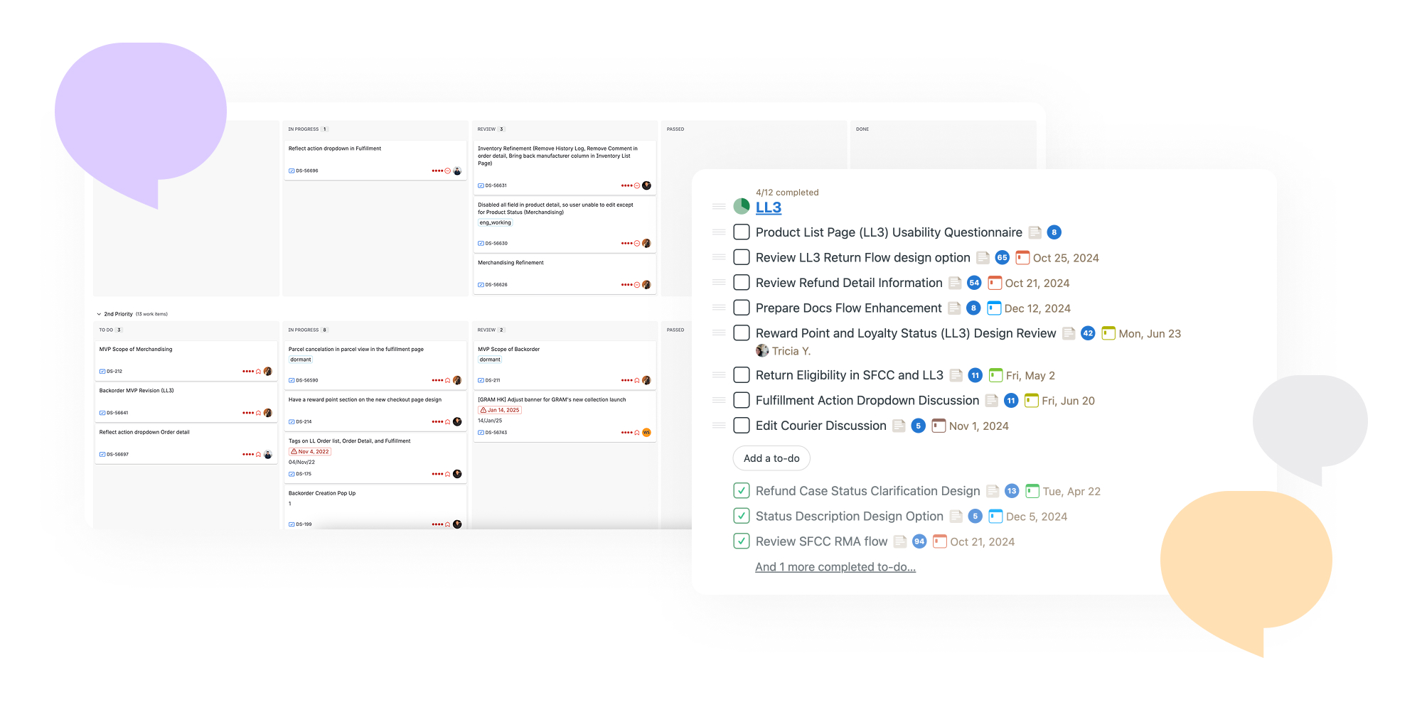
Research & Insights
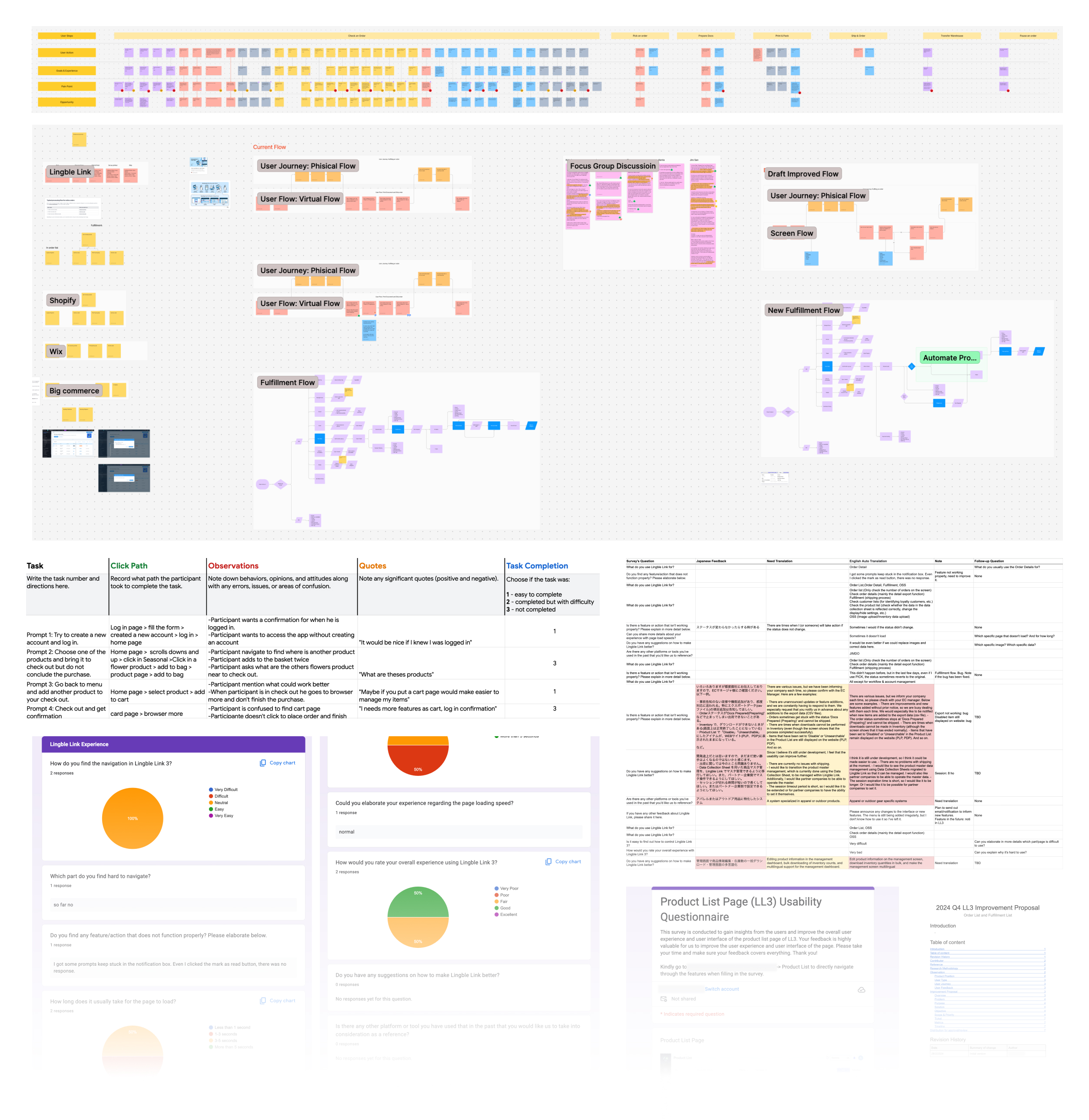
To confirm and prioritize issues, I led the design team and collaborate with the Product Owners to do both quantitative and qualitative researches. Key takeaways:
︎︎︎ Surveys and analytics showed which features were most used and where users spent the most time.
︎︎︎ Interviews with customers and partners revealed pain points in daily workflows and unmet needs.
︎︎︎ Audits of UI and processes highlighted inconsistencies and inefficiencies accross the product’s screens.
The insights gave us a clear direction for where design could have the most impact.
Design Strategy & Iteration
Based on the researches and insights, below are the actions that we did to solves the problems:
#1. Unclear priorities and fragmented workflows ︎︎︎ Solution: Enhancing the workflows, focus on the Fulfillment management page
I led the team to refine the most-used areas of the platform by enhancing small but necessary features such as simplifying action flows, improving order status display, reducing the number of steps required to fulfill an order, refining filters, etc. to make it easier for users to perform what they need. Together, these improvements made daily tasks like fulfillment, order management, and product updates significantly faster and more intuitive. Below are the improved key screens where users spend most of their time in daily tasks:
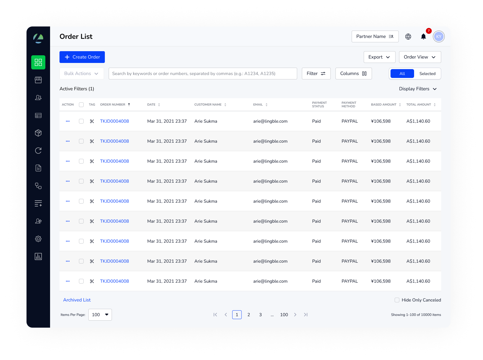
Order List
The first screen that user see when open the product. It displays all customer orders with key details. From here, users decide whether orders are ready to process, need attention, or should move into fulfillment.
Fulfillment List
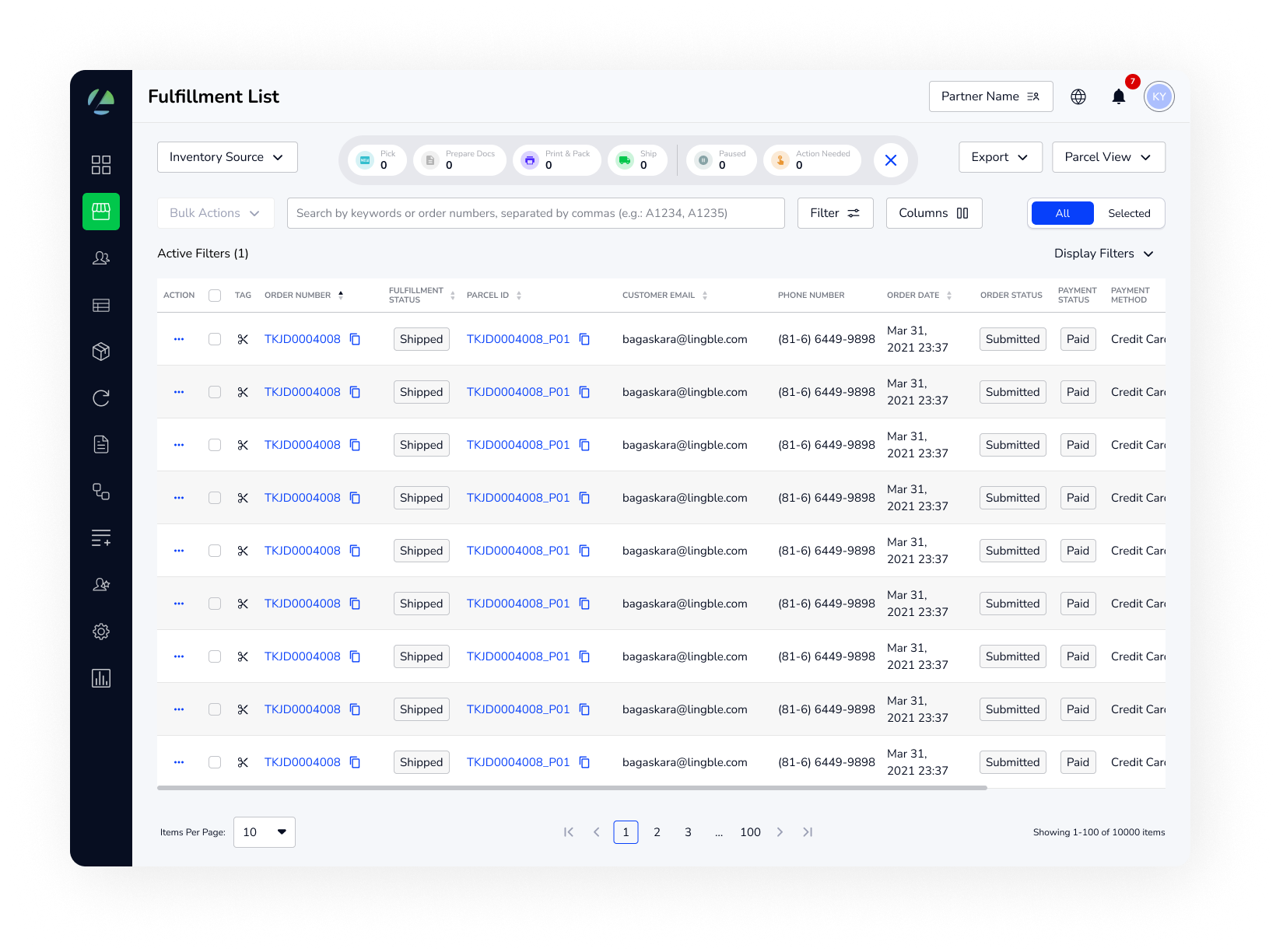
This page focuses on the logistics side, where an order moves from being placed to being shipped. It’s the page users spend most of their time on to fulfill orders, so it contains all the key information in one place. Users can take actions step by step to move the order forward, making it essential for operations teams to track progress and complete the fulfillment process efficiently.
💡️ Fulfillment workflows were redesigned to minimize repetitive actions and surface the right information at the right time, allowing users to complete orders more efficiently.
Order Details
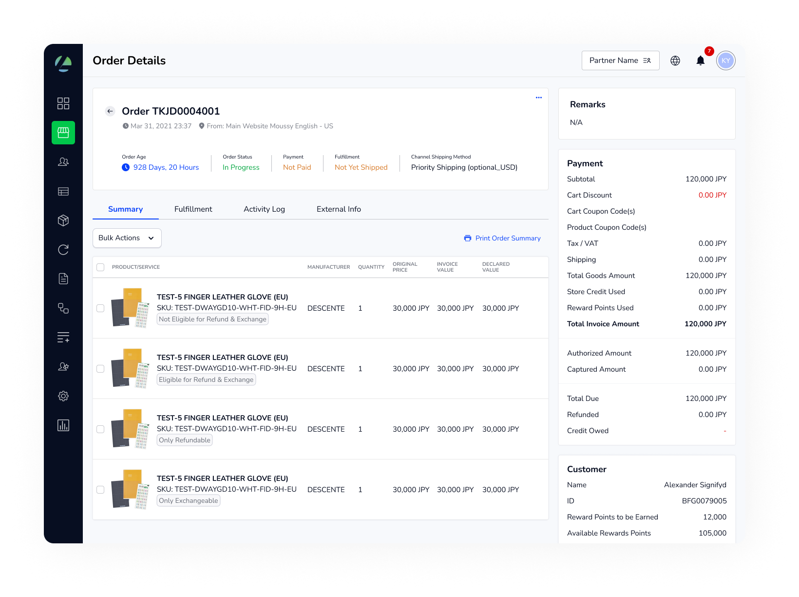
This page shows everything about a single order, including customer info, payment status, shipping details, and purchased items. It’s the main place to manage an order, where users can update fulfillment status, change shipping options, or add internal notes.
Inventory List
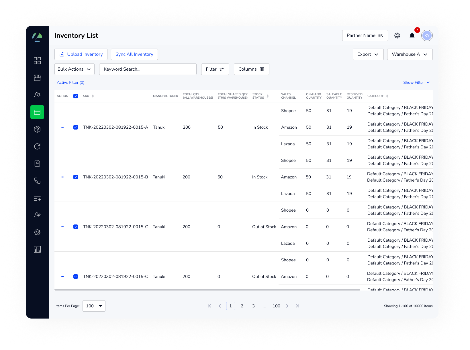
This page helps users manage stock levels across warehouses and locations by displaying key details like SKU, available quantity, reserved stock, and low-inventory thresholds. By keeping this information visible, it ensures smoother fulfillment and helps prevent stock-outs or over-promising product availability.
Product List & Product Details
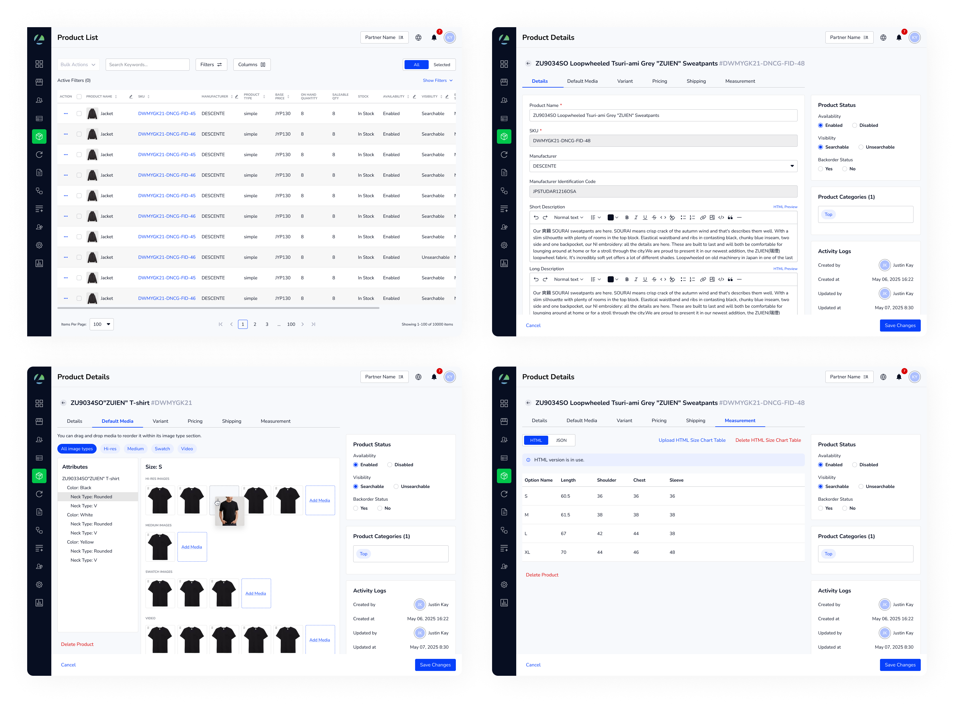
Product List provides an overview of all products in the catalog, displaying key details such as product name, SKU, price, and availability. It allows users to quickly scan, search, and filter through products to manage their catalog efficiently. While Product Details page focuses on a single product, giving a deeper view into its metadata such as descriptions, categories, images, and other attributes. Users can edit product information directly within the page, making updates faster and reducing the need to switch between tools.
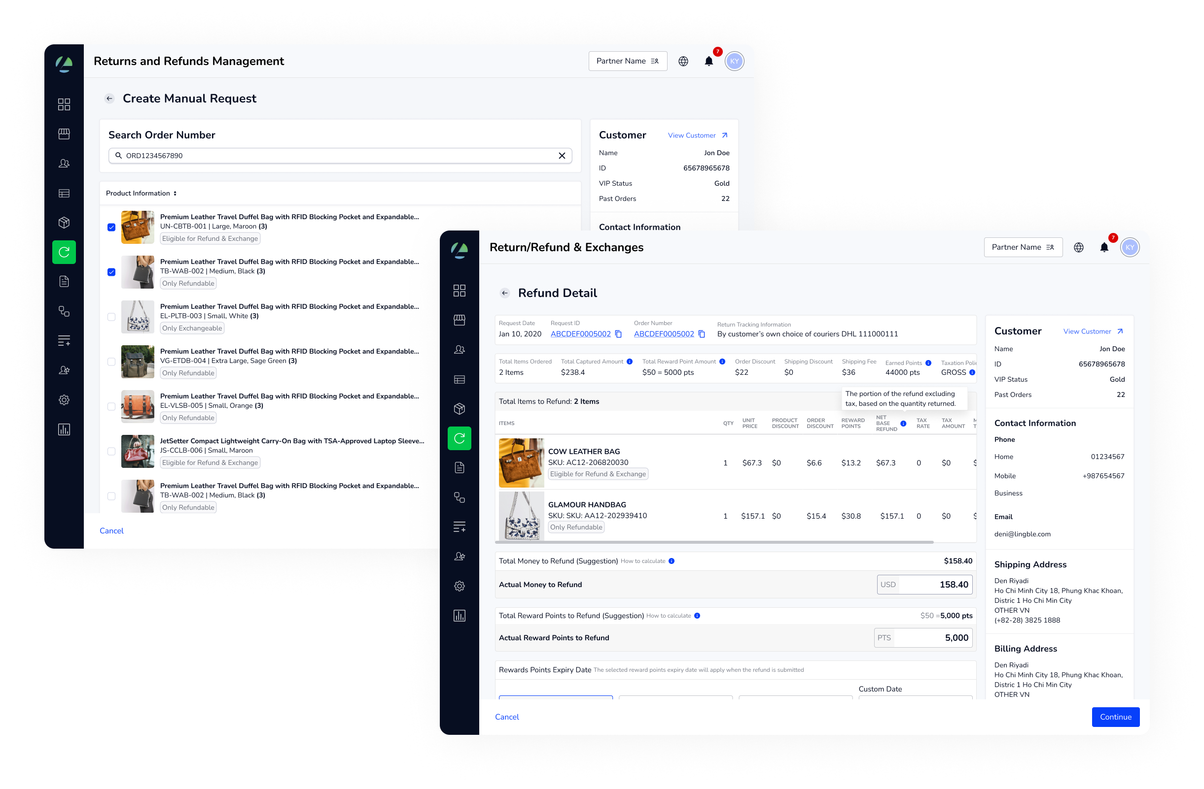
Along with enhancing the fundamental features, I worked with the business team to define a clearer roadmap and introduce new features such as Return Merchandise Authorization (RMA), giving the platform added value and competitive feature:
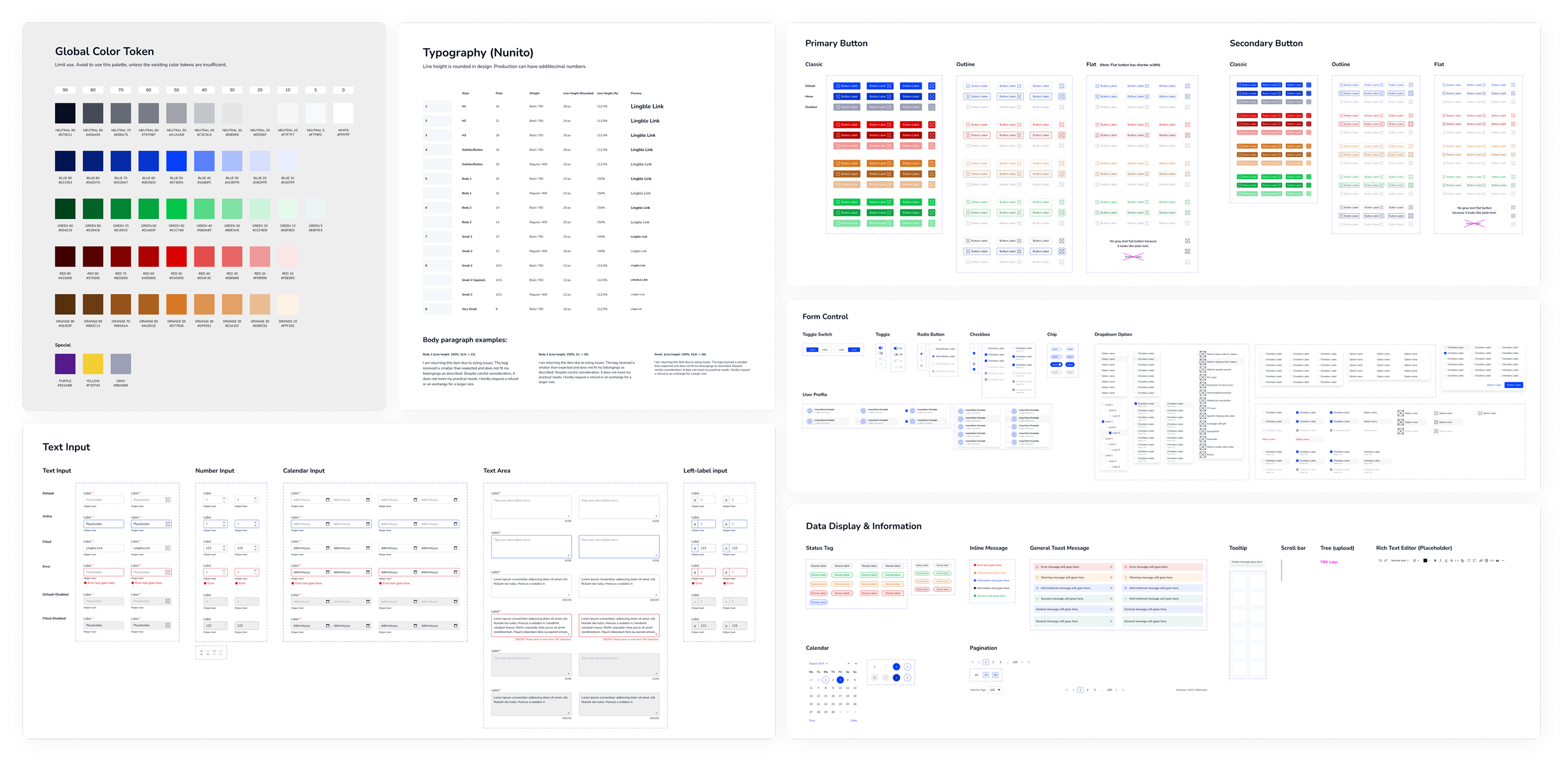
#2. Inconsistent UI and misalignment between design and production ︎︎︎ Solution: Establishing the new Design System
I led the creation of a reusable component system that not only reduced inconsistencies across the product but also bridged the gap between design and production. By working closely with engineers and QA, we aligned design files with the live product, ensuring components were scalable, easier to maintain, and testable. This balance between design needs and engineering effort improved collaboration, sped up development, and resulted in a more polished, reliable user experience.
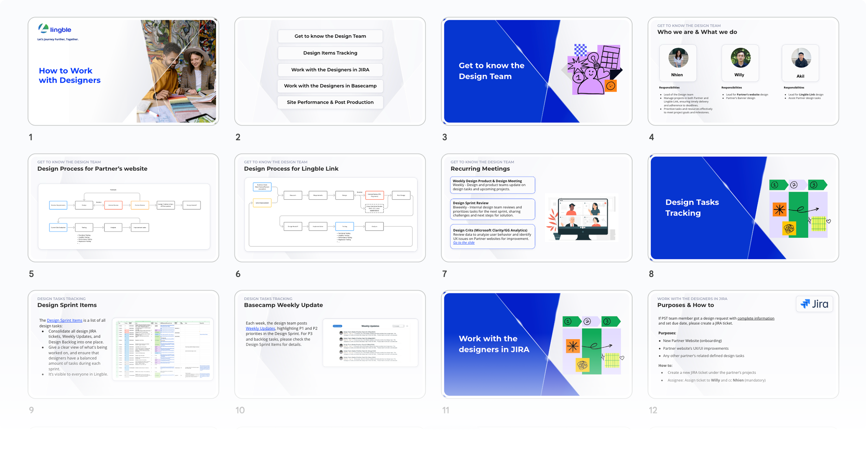
#3. Team workload and time management issues ︎︎︎ Solution: Improving Team Workflow
Previously, design tasks were scattered across Jira, Basecamp’s To-do, and sometime even personal chat, which made it hard to keep track of progress. To fix this, I introduced a single tracking sheet for design sprints and set clear principles for decision-making. This gave the team one place to consolidate tasks, making it easier to follow progress and stay aligned. We still used Jira and Basecamp to communicate with Product Owners, Customer Care, and Engineers, but internally the tracking sheet became our main source of truth.
I also improved cross-team collaboration by creating a “How to Work with Designers” guide. It explained our responsibilities, the best ways to reach us, how to request design work, and important notes to ensure requests were clear. This helped other teams understand our process better and allowed us to deliver work more consistently and on time.
Challenges in Development
One of the biggest challenges during development was the limitation of resources. We had to balance adding features with what engineering could realistically deliver. Some updates, like the type ramp in the design system, faced pushback because of the testing and implementation effort.
After several discussions, we agreed on a phased approach: Breaking the design updates into smaller steps that could be introduced gradually rather than all at once. This solution allowed us to move forward without overwhelming the engineering team while still improving the product over time.
Impact
These changes led to faster and smoother workflows for users managing fulfillment, while reducing inconsistencies that had previously caused confusion and wasted time. At the same time, collaboration between design and engineering became stronger, with clearer team processes in place to maintain quality even under tight deadlines.
Reflection
This case study wasn’t about one big redesign but about systematically raising quality across product and process. I learned about the importance of balancing speed and scalability in a startup environment. Also, leading the design team meant not just delivering designs, but building systems and processes that supported long-term success.