ShopBack Inbox
Revamp Project | 2020🌟 How to increase company’s profits through the use of Inbox – a common feature in almost every mobile app, but still ensure good user experience?
My Role in this project
Product Designer, User Researcher
Product Designer, User Researcher
Platforms
iOS, Android
iOS, Android
What is this project?
Context
Inbox (or Notification) is one of the most common features in mobile apps. User opens Inbox to view the app’s announcements, notifications then tap on it to be redirected to a specific screen that contains the information they want or need to see. In e-commerce app market, Inbox is not just a place to display notifications. It’s also a potential area to introduce user to the relevant promotions and deals in a form of notifications. By checking Inbox, user may intentionally or accidentally open a promo notification, therefore likely increases the chance of shopping and purchasing, which helps to increase the company’s profits. The question is how can I help ShopBack earn more profits with the app’s Inbox?First observations
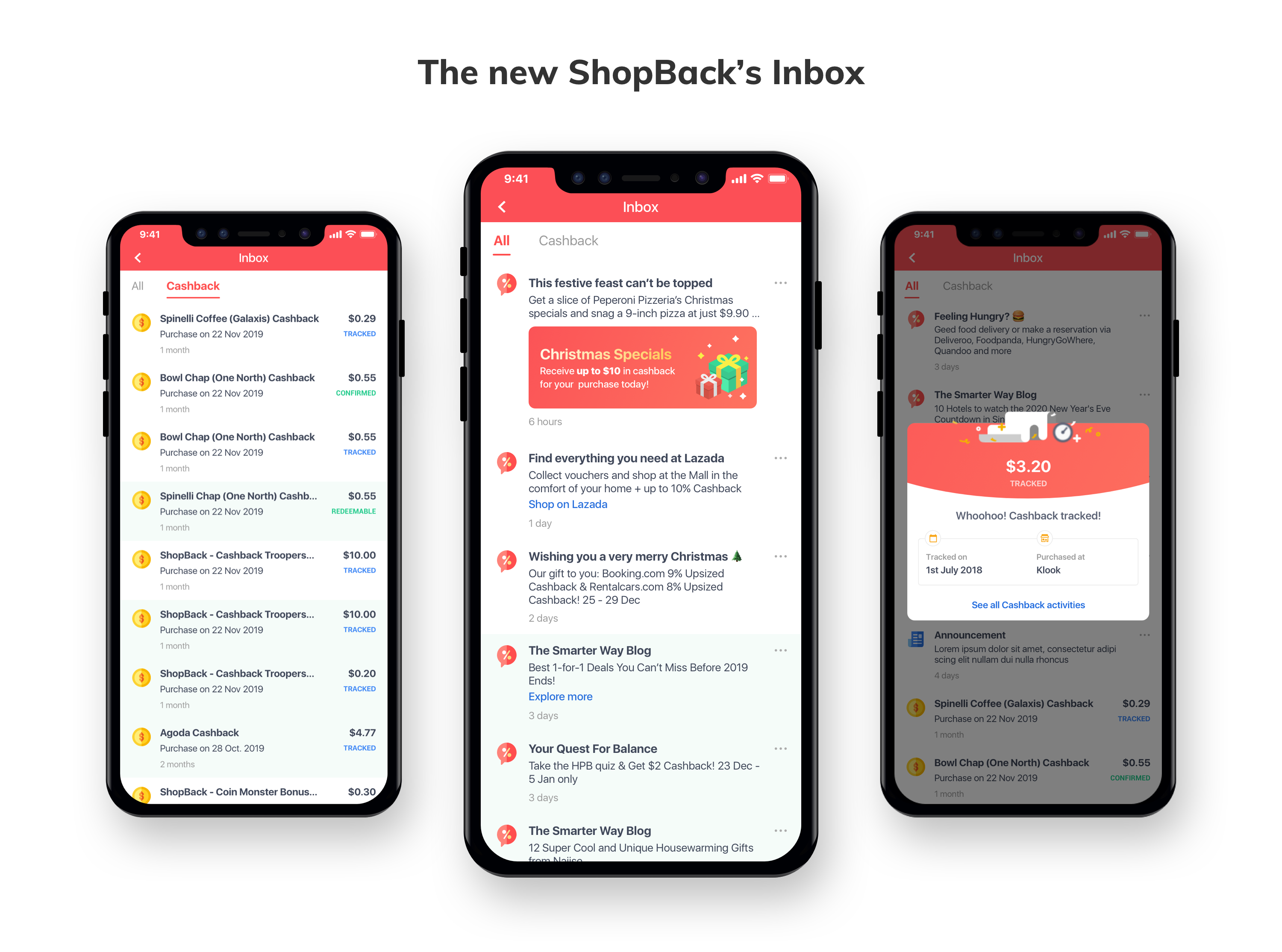
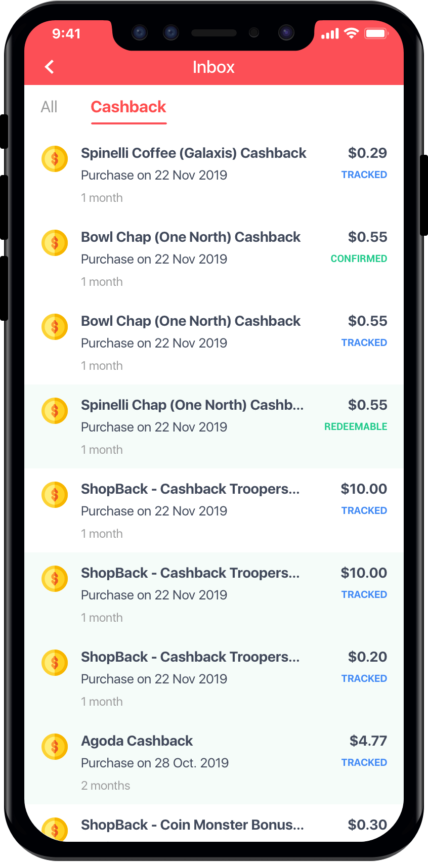
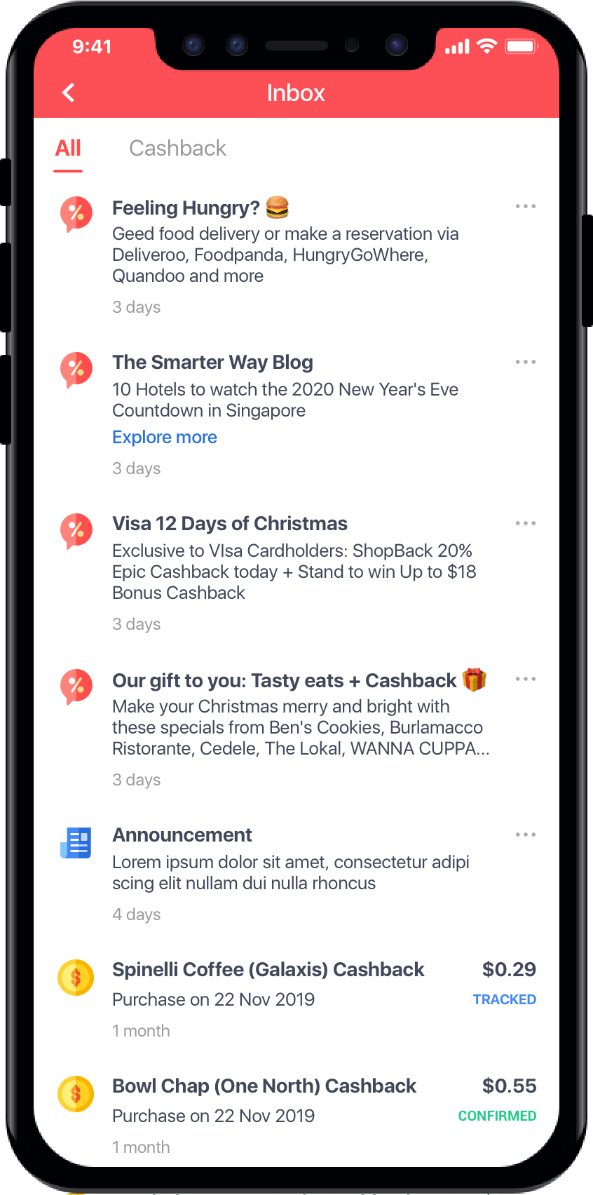
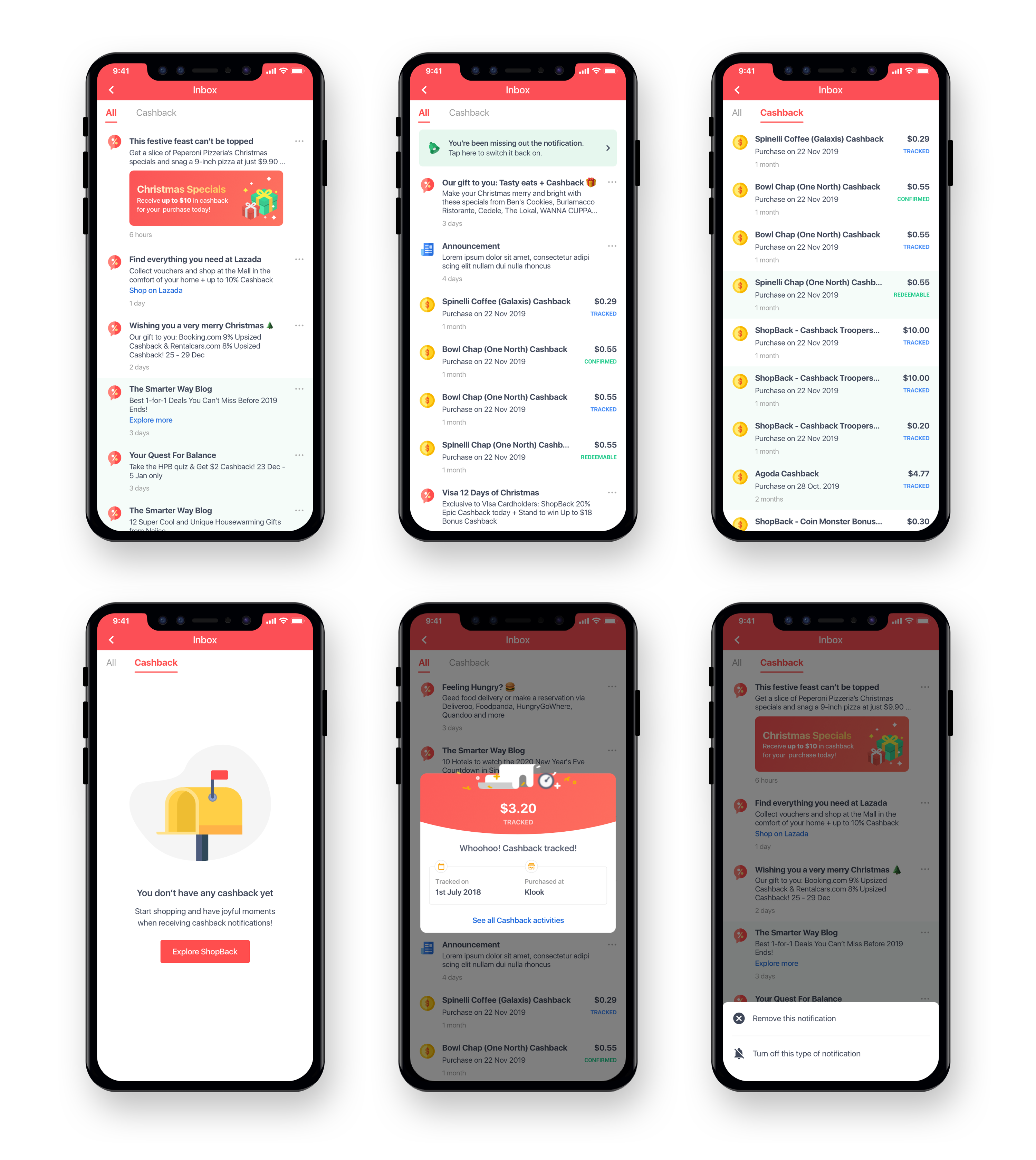
There are 3 notification types in the current Inbox: Cashback status notifications, App’s notifications, Promotions. There are 3 tabs: All, Promo and Cashback. App’s notifications have no own tab and are under All tab. User can tap on the icons to navigate between the tabs. The format of each type are basically the same: Title, body, date. In a quick glance, I can recognize the promotions by... a bunch of emojis in the title and body. Because there are so many emojis in almost every promotion, all look the same and uninteresting to me. I feel like looking at my email’s spam folder and obviously don’t want to open any of it. I can still distinguish the Cashback notifications by the money and status on the right side of the notification though, and easily navigate to the Cashback tab to view only the Cashback notifications.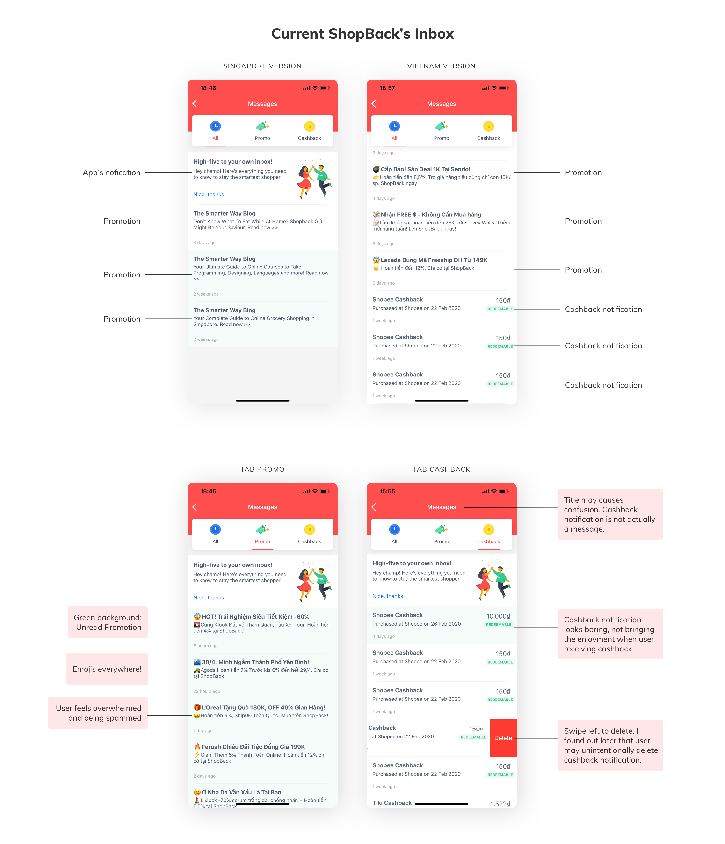
Let’s look into the metrics
After opening Inbox, the percentage of users who continue to open a promotion is 4.26% for Android and 1.35% for iOS (in the last 30 days). Previously, the team had not thought about increasing profits through Inbox, so there was no base line to compare to. But based on my observations, the uninteresting promotions somehow stifled this rate. My hypothesis was by improving the design of promotions in particular and the Inbox in general, we could increase these conversion rates.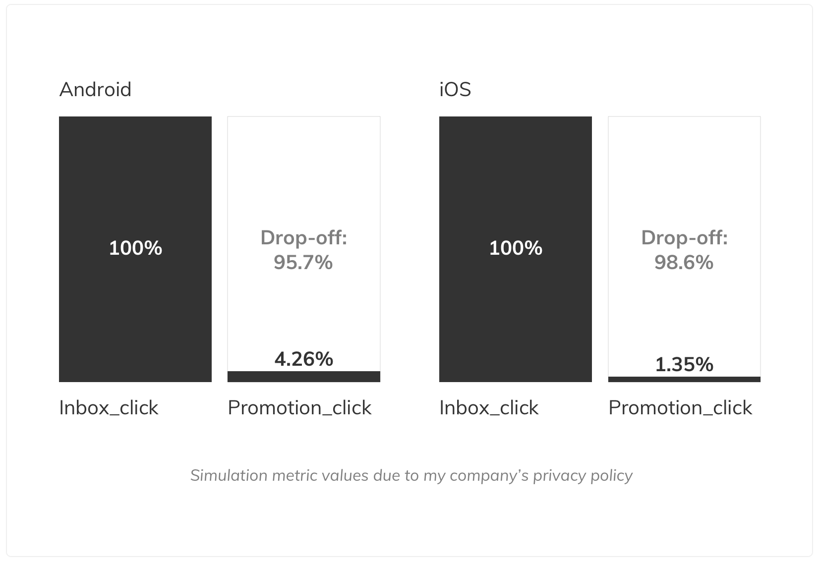
What are the goals and business outcome?
#2: Increase feature engagement by improving user flow.
#3: Redesign the icons and typography to improve the look and feel.
Let’s start researching
1. Benchmarking with other apps
I looked into e-commerce apps and also popular apps to see the pattern and to get some ideas. E-commerce apps tend to have colorful Inbox, with icons, pictures and a lot of contents while popular apps lean toward simple, clear look with short text. Lazada’s Inbox has pictures in every notification. Grab displays only text and user can tab to view a details screen. LinkedIn puts CTA buttons in some special notifications to help user quickly do the next action which is related to the notification.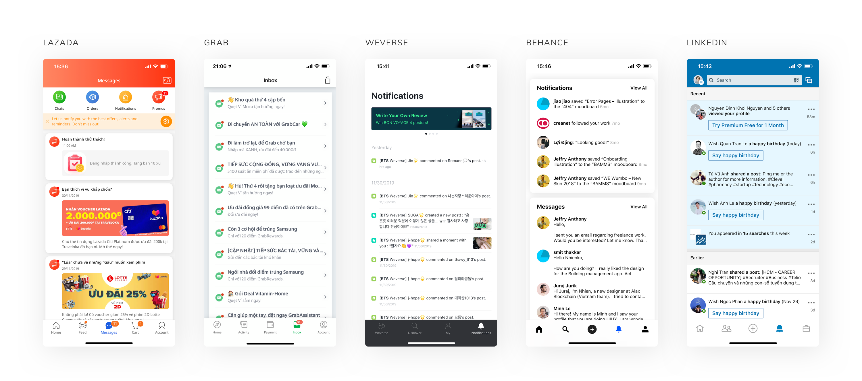
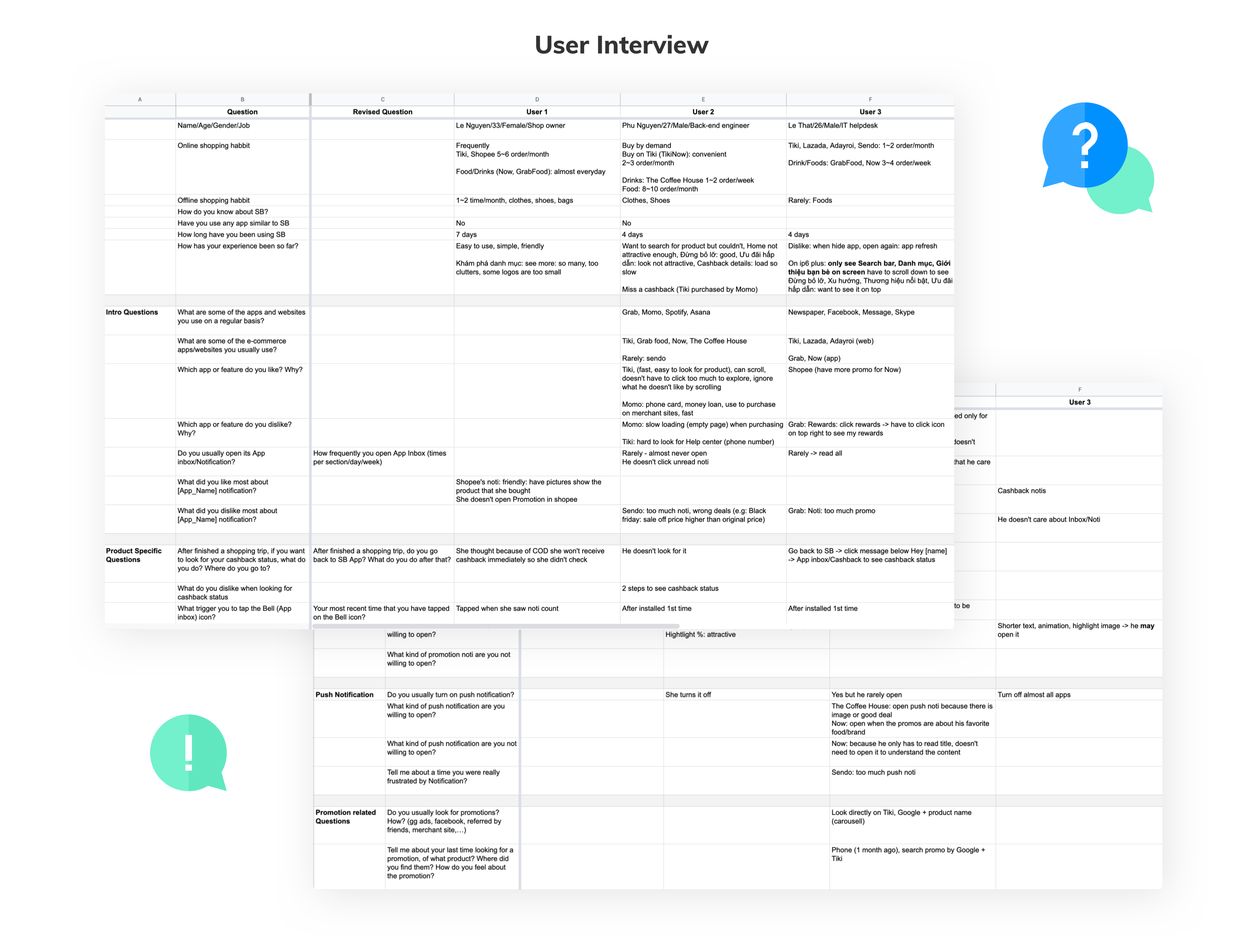
2. Persona & User Interview
At that time, ShopBack Vietnam didn’t have budget for user interview, therefore I asked my friends to use ShopBack for a while then did the interview with them. I did 2 interviews face to face and 1 through a Skype call, 30 minutes for each one. Below are the personas and the spreadsheet with my questions and their answers.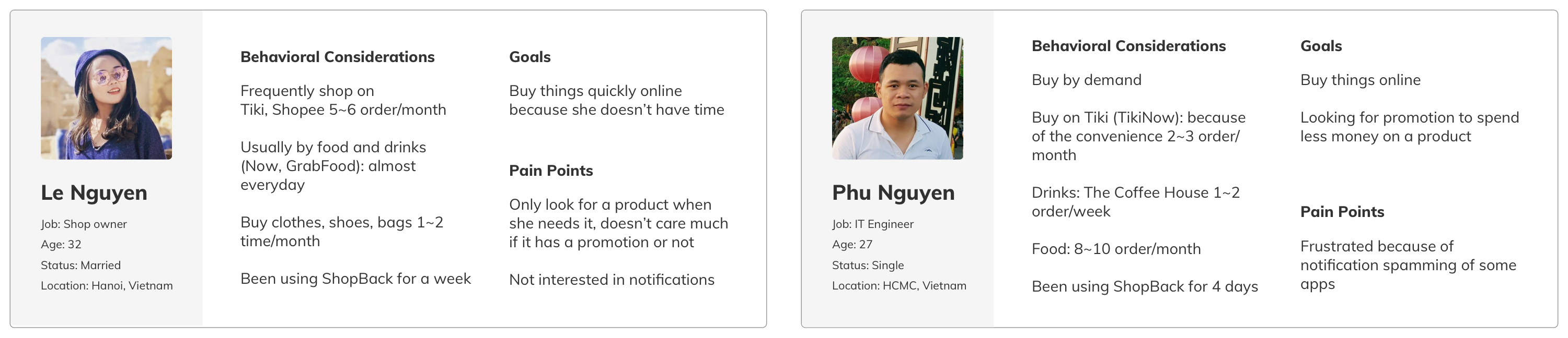
3. What I conclude after the interviews
- Users rarely open promotions
- They may open a promotion if it’s related to what they are looking for.
- They may open a promotion if it attracts them (image, animation, icon, etc) but won’t open it if there are too many of those elements.
- One point I didn’t anticipate: One of the user accidentally deleted a cashback notification because of the swipe gesture and couldn’t undo it.
Solutions & Designs
With research results, I had a research analysis meeting with the Project Manager and then started to work on the design. There were many brainstorm meetings, discussions and internal usability testing, but in the context of this case study, I’m presenting only the final hi-fi designs and solutions.
Solution #1: Re-structure the type of notifications
I discussed with the Project Manager to determine the type of notifications and their structures (icon, title, body content, cashback number and cashback statuses, etc). Then we will discuss with the Marketing team to have a guideline for each element in the structure.There will be 2 promotion’s type: Promotion without image and promotion with image for when we need to emphasize a special promotion, and we can sell that spot as an advertisement for merchants.
With the type of promotion that user will be redirected to a website or other app, I added a CTA link so user can expect that they will be redirected to an external link.
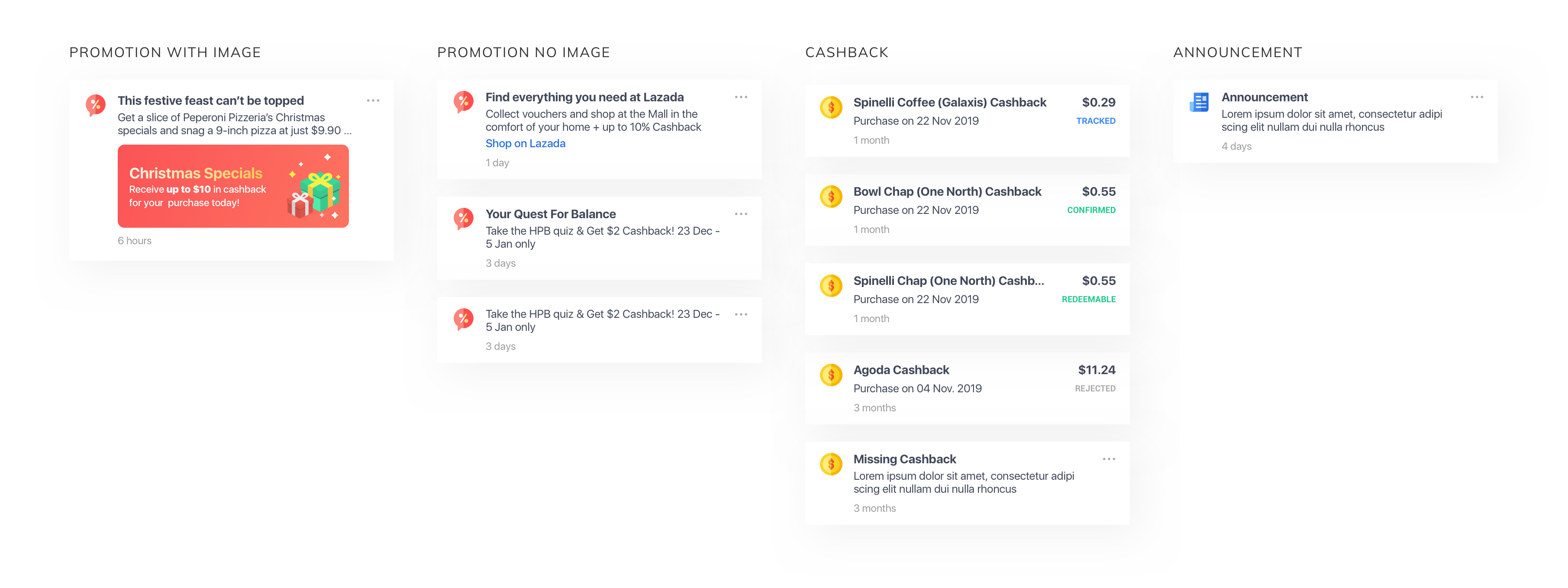
Solution #2: Redesign the layout, icons and typography (and no more bunch of emojis!)
Time to clean up the old design and bring a new fresh and delight look to the Inbox! I amended the layout and padding; redesigned the tap header, the icons and the typography to make it more modern and easy for the eyes.I also communicated with the Marketing team to have a rule for emoji. We will only have one emoji in each promotion and it shouldn’t be at the beginning of the line to avoid the icon’s area.

Solution #3: Remove the Promo tab
The metrics show that users navigate to the Promo tab but rarely open the promotions within it. So is the current Promo tab valuable? What if we completely remove the tab and put all the promotions inside All tab? Then making the promotion look like a normal notification which inform user useful information instead of throwing a bunch of advertisements at them. Hypothesis: Now user may not think of a promotion as an annoying thing which they usually hate or ignore. User may now see them as a notification but with promotion’s content. And when scrolling down Inbox, they may find an interesting one and want to open it.But if there is a scenario when we still want to display a clear ‘advertisement’? Display a promotion with an image in it. But it should have low appearance frequency unless we want to face the spamming problem again.
Solution #4: Replace swipe gesture with an option menu and provide ‘turn off this type of notification’
I found out that user may accidentally delete notifications because of the swipe gesture and couldn’t undo it. Therefore, I got rid of the swipe gesture and replaced it with an option menu. User taps the 3 dots icon, then they can choose to delete the notification.For the cashback notification, currently it is used as cashback history and shouldn’t be deleted, therefore I removed the option of deleting the cashback notification.
I also added the new option Turn off this notification to help user receive fewer promotions of the merchant that they don't like.
Usability Testing
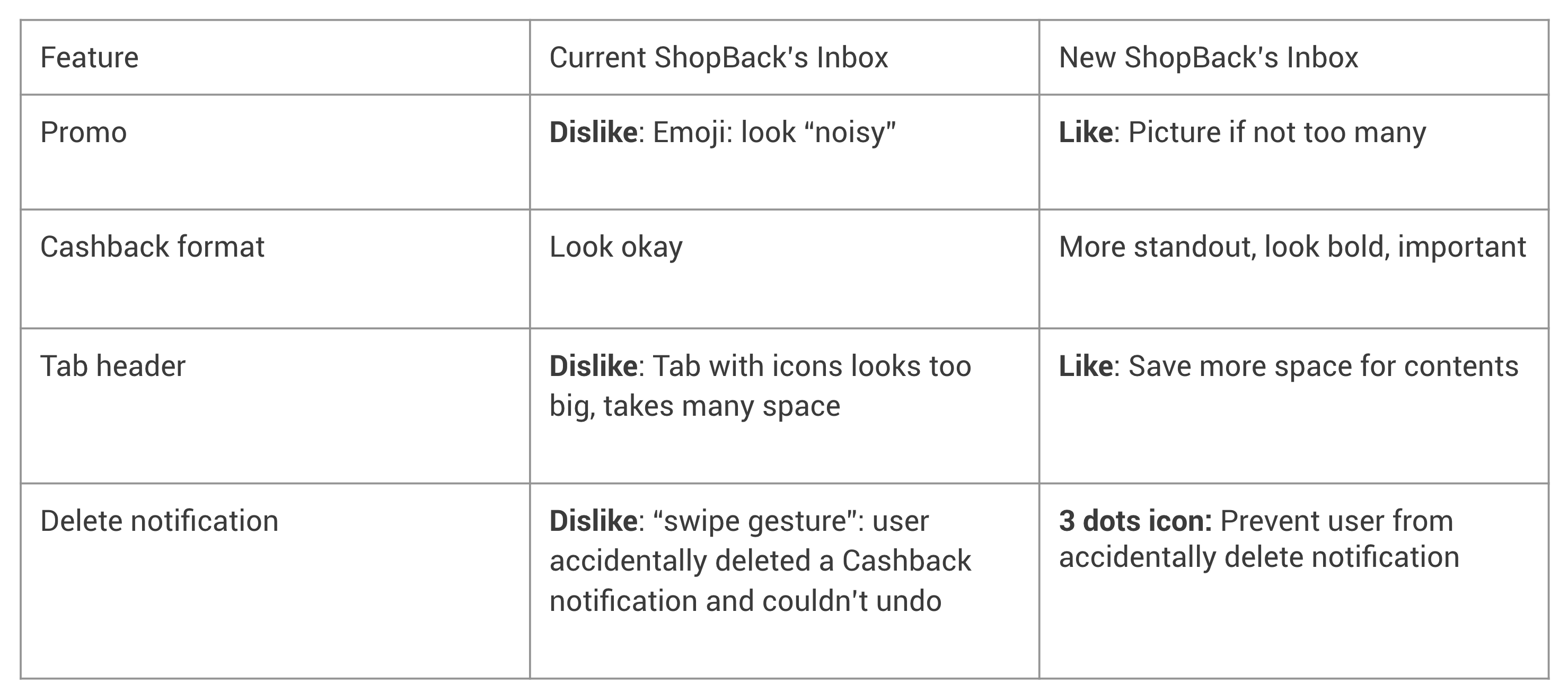
After finalize the design, I did the hi-fi prototype and asked the users who I interviewed before to try the new version of ShopBack’s Inbox. I wrote down their opinions and revised the designs based on their reasonable points. Below is the summary of users’ comparison between the old/current and the new ShopBack’s Inbox.
Reflection
Inbox was my very first project at ShopBack. It was also the first time I could access data tools, analyzed the data and used it to help me with the design decision. At the time of writing this case study, the new Inbox was not implemented yet. There were shifting priorities so this project was put in the backlog and would be continued in the future.