My Role in this project
Product Designer, User Researcher,
Illustrator
Product Designer, User Researcher,
Illustrator
Platform
Android
Android
What is ALAX?
ALAX is a Mobile Game Distribution Platform based on blockchain technology with the intention of bringing fresh air to the gaming industry. ALAX focus on unbanked smartphone users in Asia and beyond.
How ALAX works?
Instead of using a credit card, all transactions in ALAX Store are proceed with tokens. ALAX's tokens are distributed to retailers. Game developers publish their games on the ALAX Store. Gamers can buy tokens from retailer then top up to their account and use it to pay for games. Profits will be paid to the developers, and ALAX gets commission from that.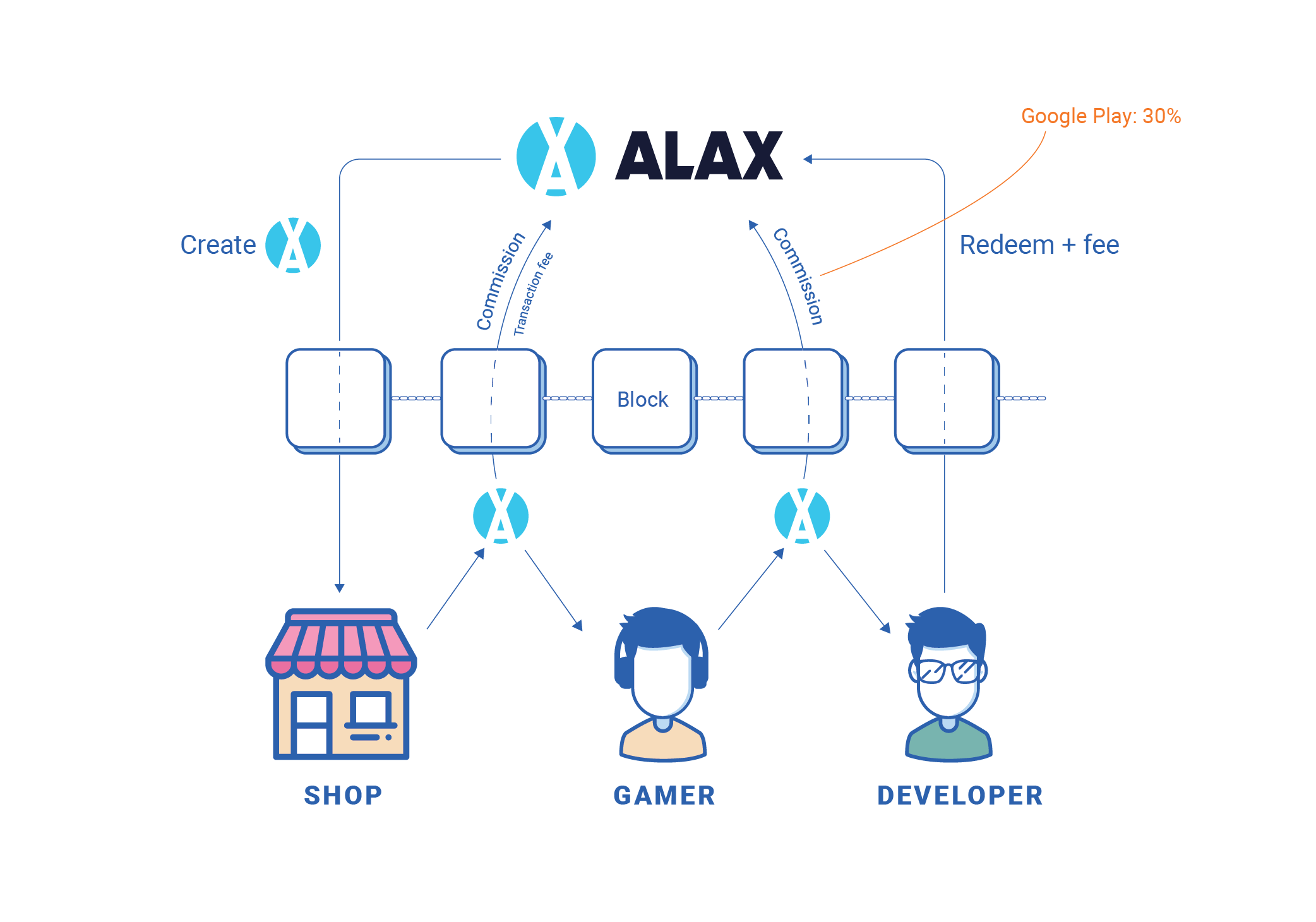
The Challenges
Understanding the product’s stage
I joined ALAX at the time the company was founded about half a year in Vietnam. The project has just started, so it's pretty inceptive. However, the main features were already available on production. ALAX now needs a product designer who has knowledge about the Vietnamese market and interested in blockchain to lead the design direction of the entire line of products.What is the Plan?
During the first week of working at ALAX, I carefully observed the initial design and identified the existing problems. Does the current design only need a little modification, or should I do the entire remake? Does it reflect the company’s objectives? Or is it appeal enough and meet user need? I need to define my role in this project and come up with specific plans for the design.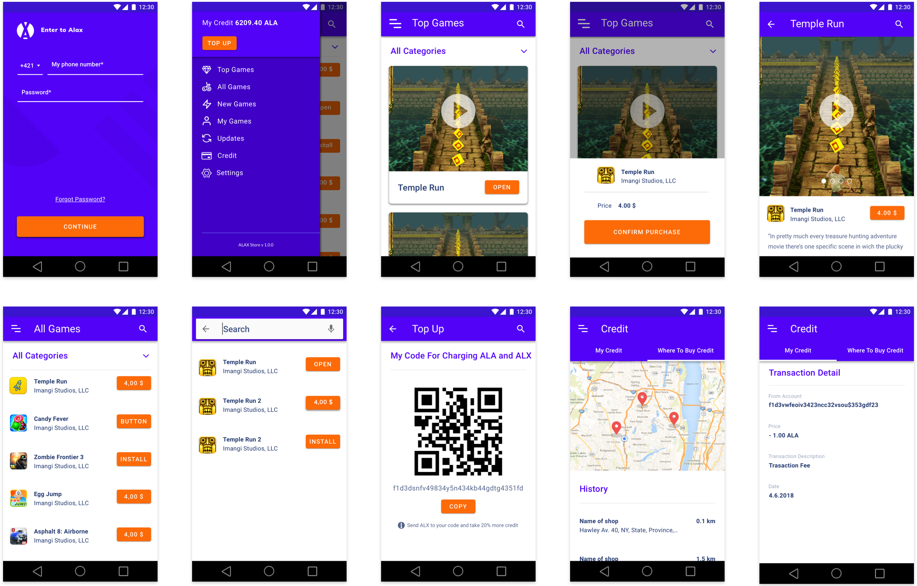
Old ALAX Store’s design
The Problems
Problem #1: Lack of research
The first problem was the lack of user research documents. There were some business and markets research documents but there were no user research or design documents. It seems the very first design didn’t have a solid foundation.Problem #2: Unattractive visual
My first impression about the visual is not good. Violet blue and orange color don't work well together, creating a sense of contention. User doesn't know which color to focus on. Similar text scales makes it difficult to distinguish content sections. Shadow is bold and hash, which feels heavy. In addition, it's a game store but the layout is too simple. It lacks of images and app's information that is often found in other game stores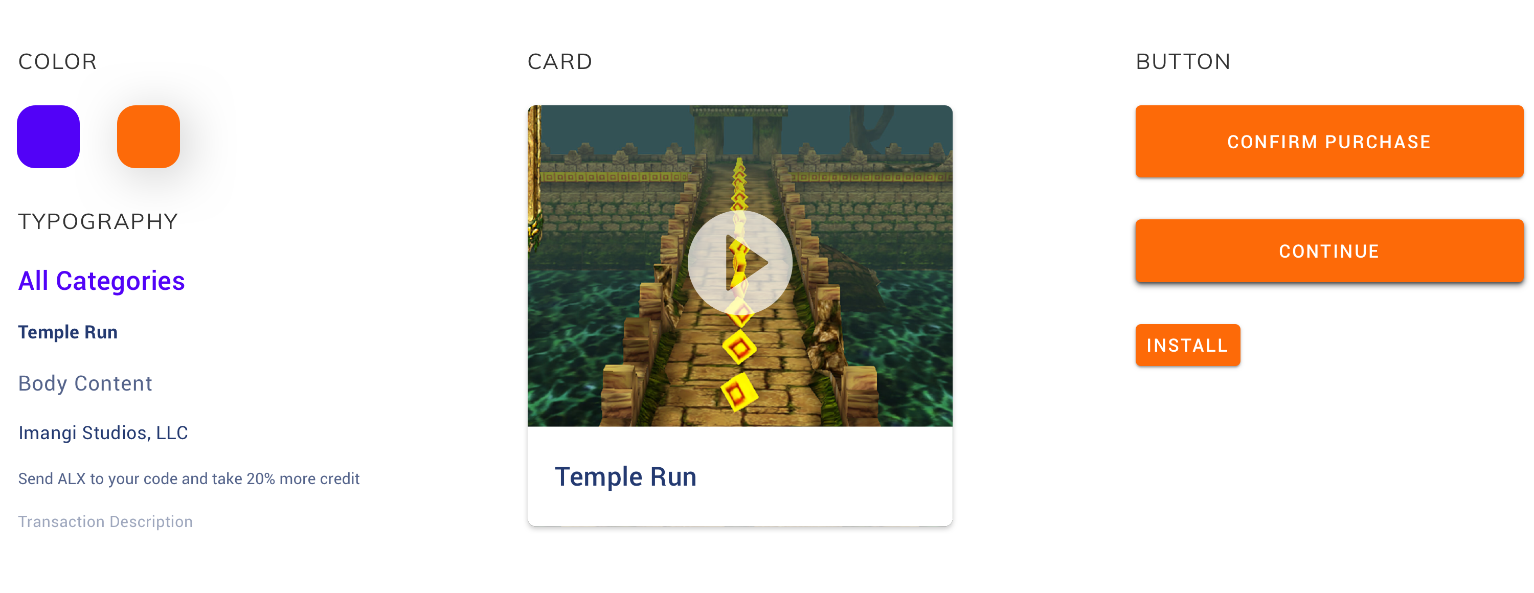
Problem #3: Too many similar screens. Any exciting thing to explore?
When playing around with the app, I noticed that there were screens with different titles and purposes, but had the same interface. Homescreen (Top Games) and Game Details had quite similar interface, with a large thumbnail at the top of the screen. My Game, New Game, Updates were identical. When switching between screens, I couldn't distinguish immediately. It was more like a statistical list than an exciting game store. What are the main benefits I can get from the ALAX Store? What makes me use ALAX and not other apps? Those things I couldn't find.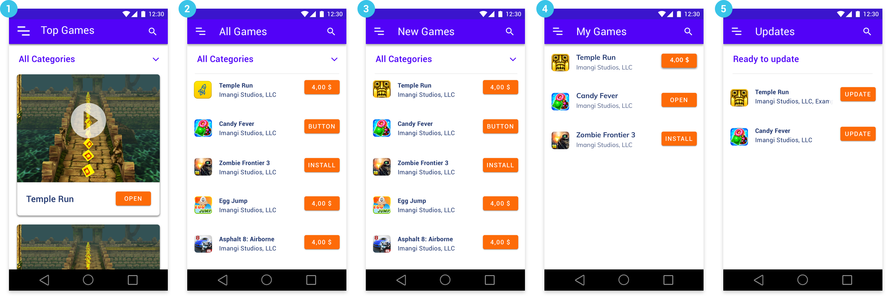
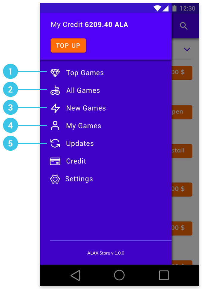
Problem #4: Main features & Hamburger Menu
Hamburger menu was used as the app's navigation. The hamburger menu serves its purpose of condensing information but it may have significant drawbacks. The most basic location of the hamburger menu on mobile apps is in the top left corner. This is the hardest place to reach on a mobile device for a right-handed user, and doesn’t exactly encourage engagement. People also has to tap the menu once before being able to see what their options are, and then tap again when they’ve found the right option. The main problem with hamburger menu: Lower discoverability, less efficient, not glanceable. Therefore, I provide the solution in the next section of this case study.🌟 The Solutions
Solution #1: Understanding business goals and user needs
By using User Center Design Canvas - a UX tool combining user needs with business goals, I identified target users, defined product and market fit, determined the competitive advantages, understand unique value proposition and improved the brand communication strategy.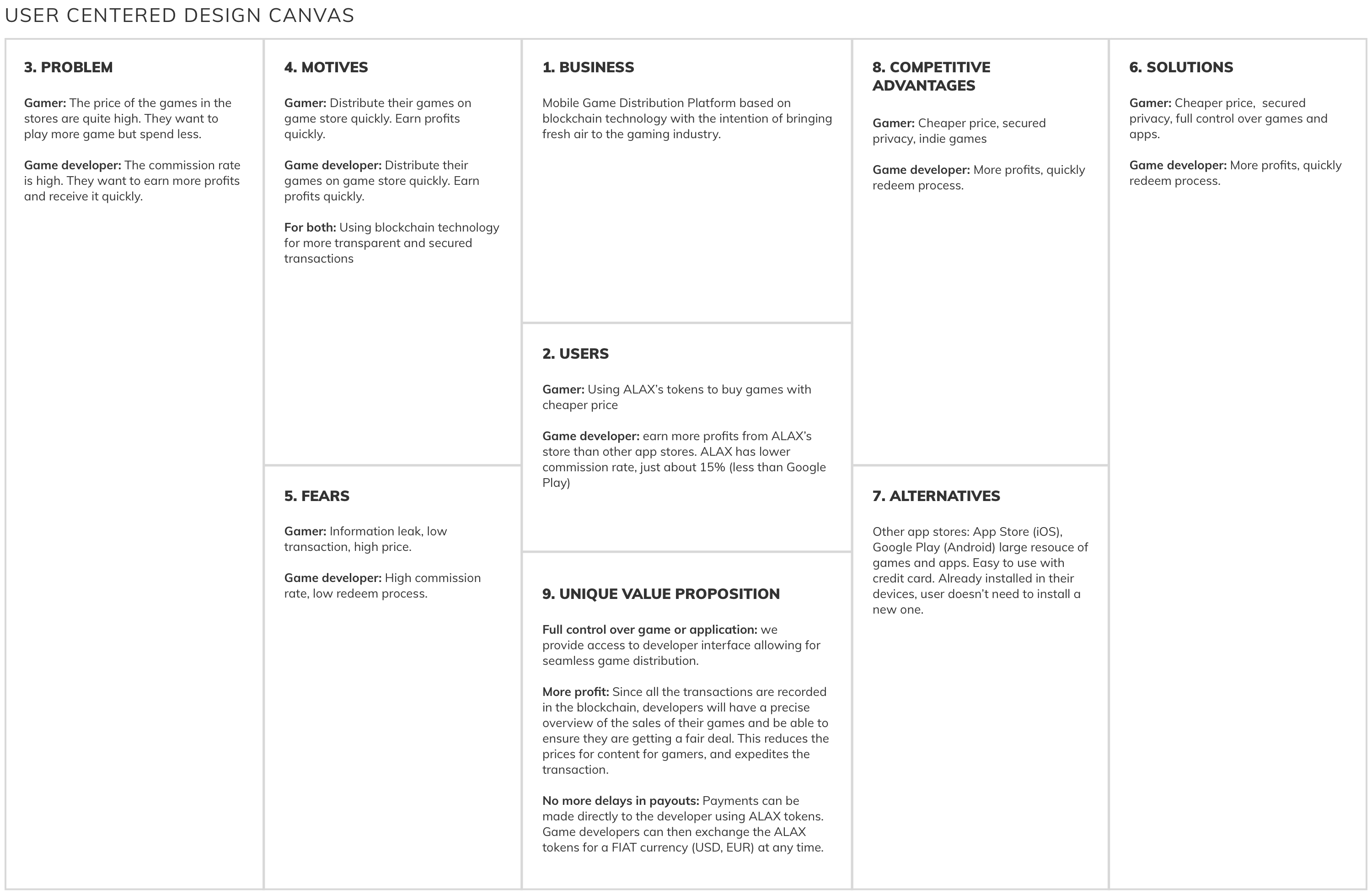
Solution #2: Clarify the main features and the flows
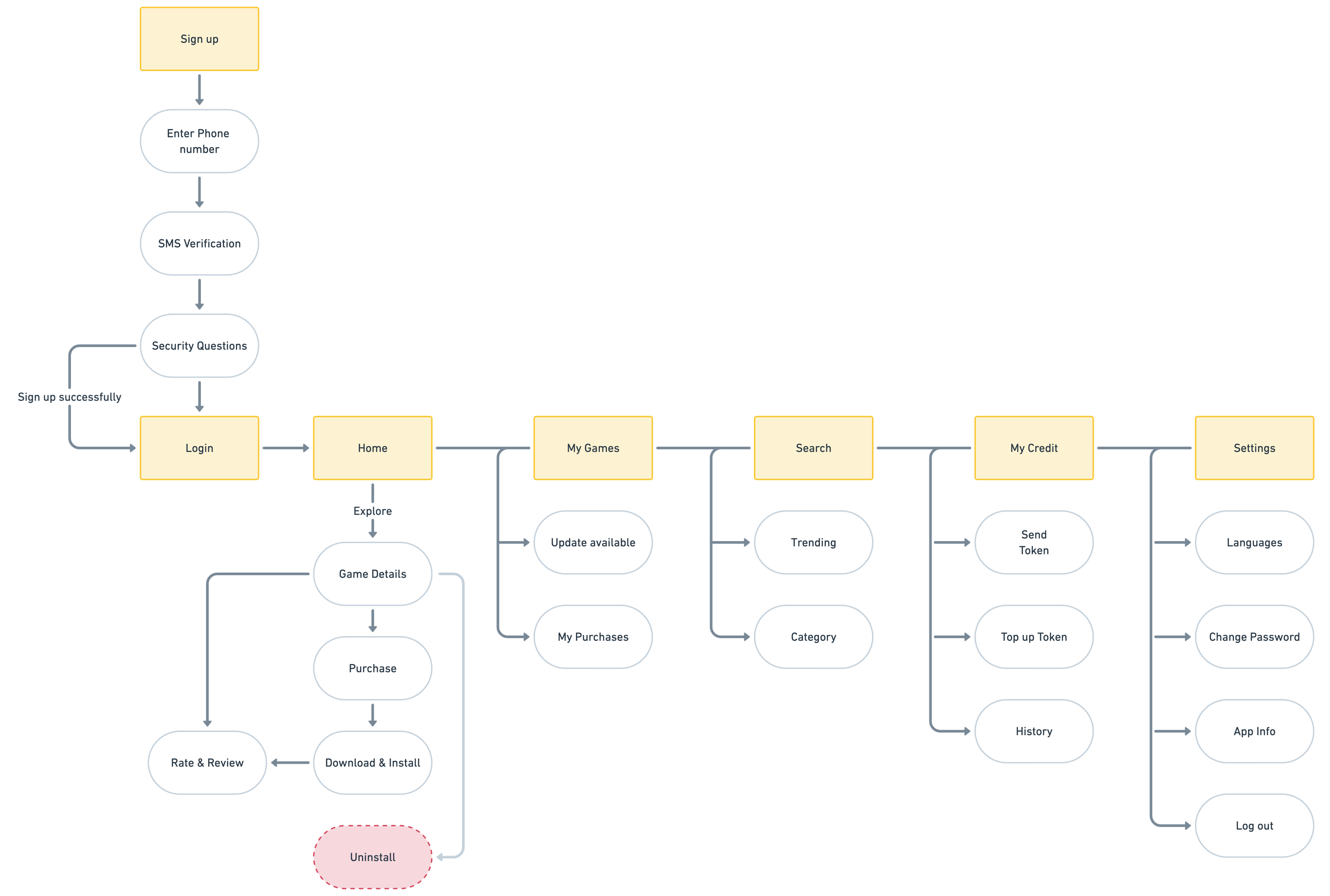
After understood the business goal and user needs, I reviewed the entire app and restructured the main flows. I grouped some same screens/features and put it into one screen. I also introduced new feature: Search. Then I made a presentation proposal for the Product Owner and the Development team to review and discuss. After discussion, we agreed with the diagram below.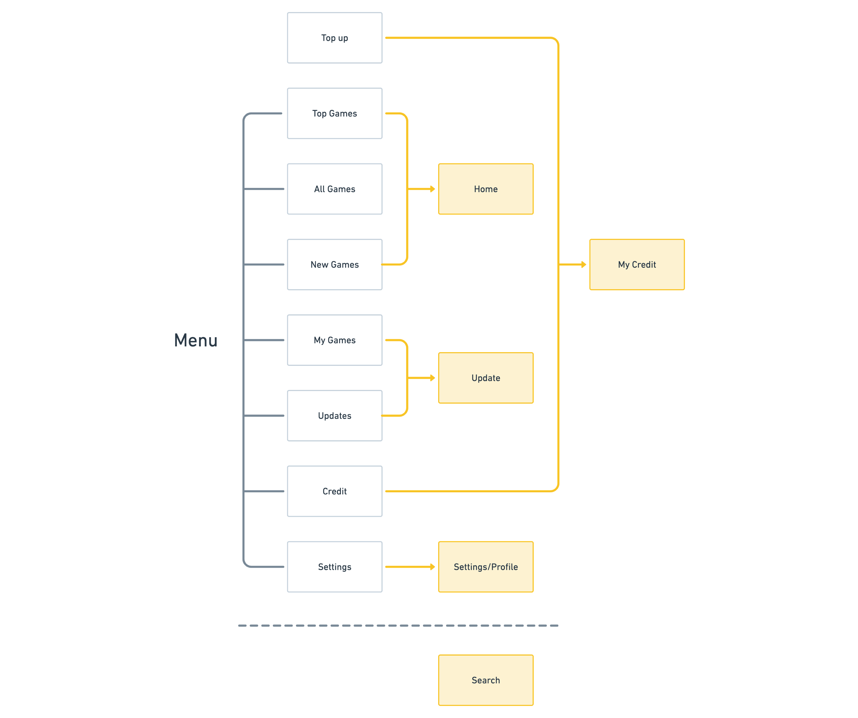
Having agreed on the main screens, I continued to identify child-level screens by drawing main flows. Based on this wireflow, I know which screens I need to design and also make it easier for the engineer team to predict the future implement timeline.
Solution #3: Bottom navigation
To solve the problem of the hamburger menu, I suggested organizing and grouping similar features into one main feature. Each main feature will be shown at an icon on the bottom navigation. Along with the new feature Search, there will be 5 main tabs on the bottom navigation: Home, My Games, Search, My Credit, Settings.
Solution #4: UI Revamp & Design System
We decided to revamp the entire UI of the app. I tried exploring many options of colors, typos, layouts, styles, illustrations, etc. After some discussions with the team, we agreed with one style that suits the app the most. We decided to remove the blue color, using only one orange as the primary color. Blue will be used as a primary color for another ALAX’s product - ALAX Pay. I systematize the color palette and typography to increase the reading visibility. I was working on the design system collateral with the new design and let the engineer team approach it soon enough to build the consistent look for our app.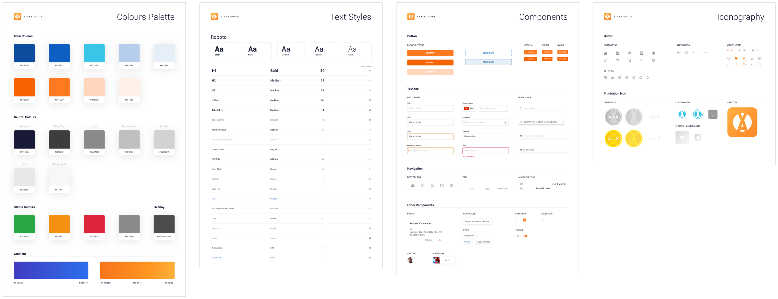
Wireframes
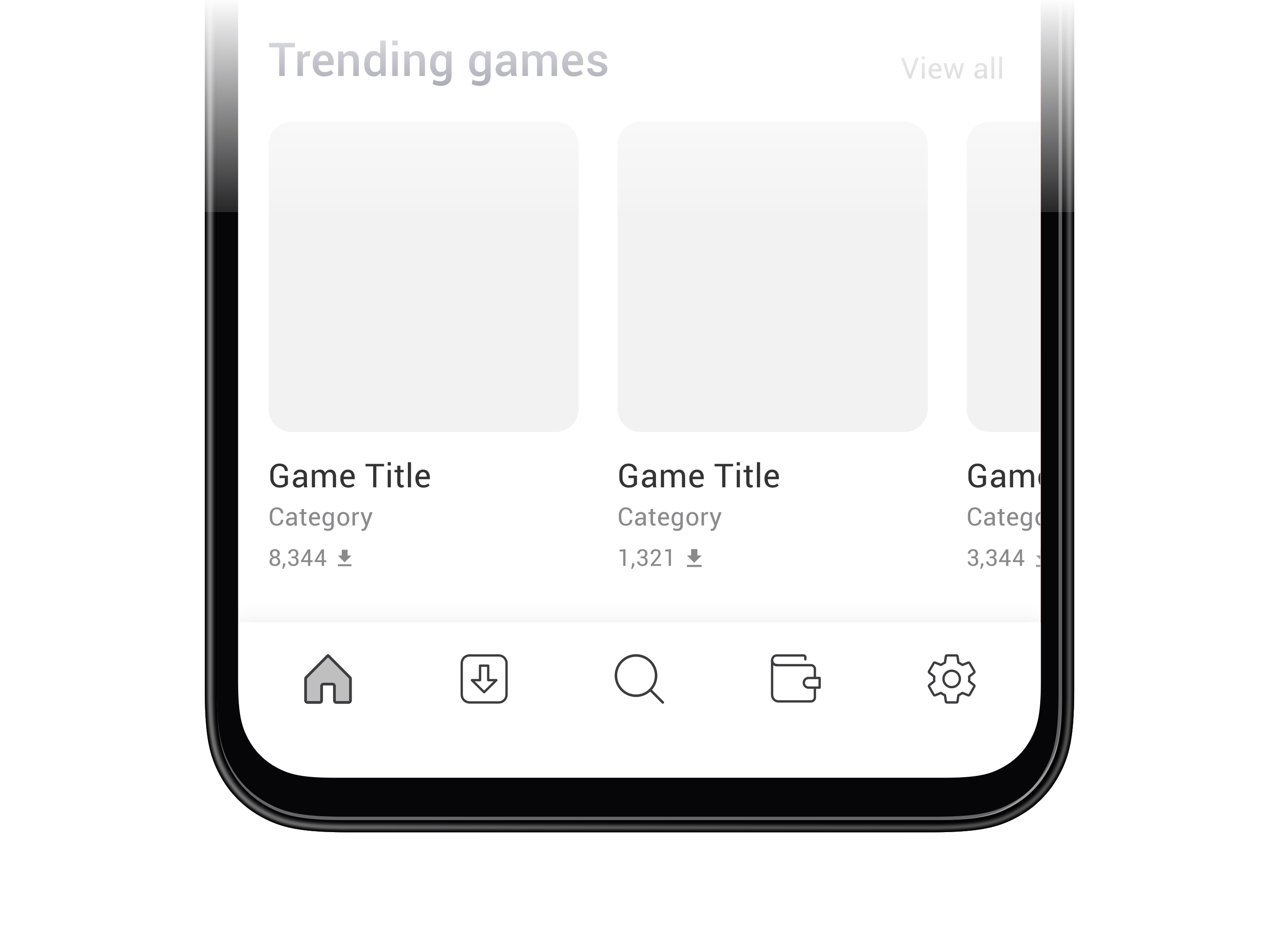
Below is some wireframes of ALAX's Store. To shorten this case study, I only present some key screens.
Final Designs
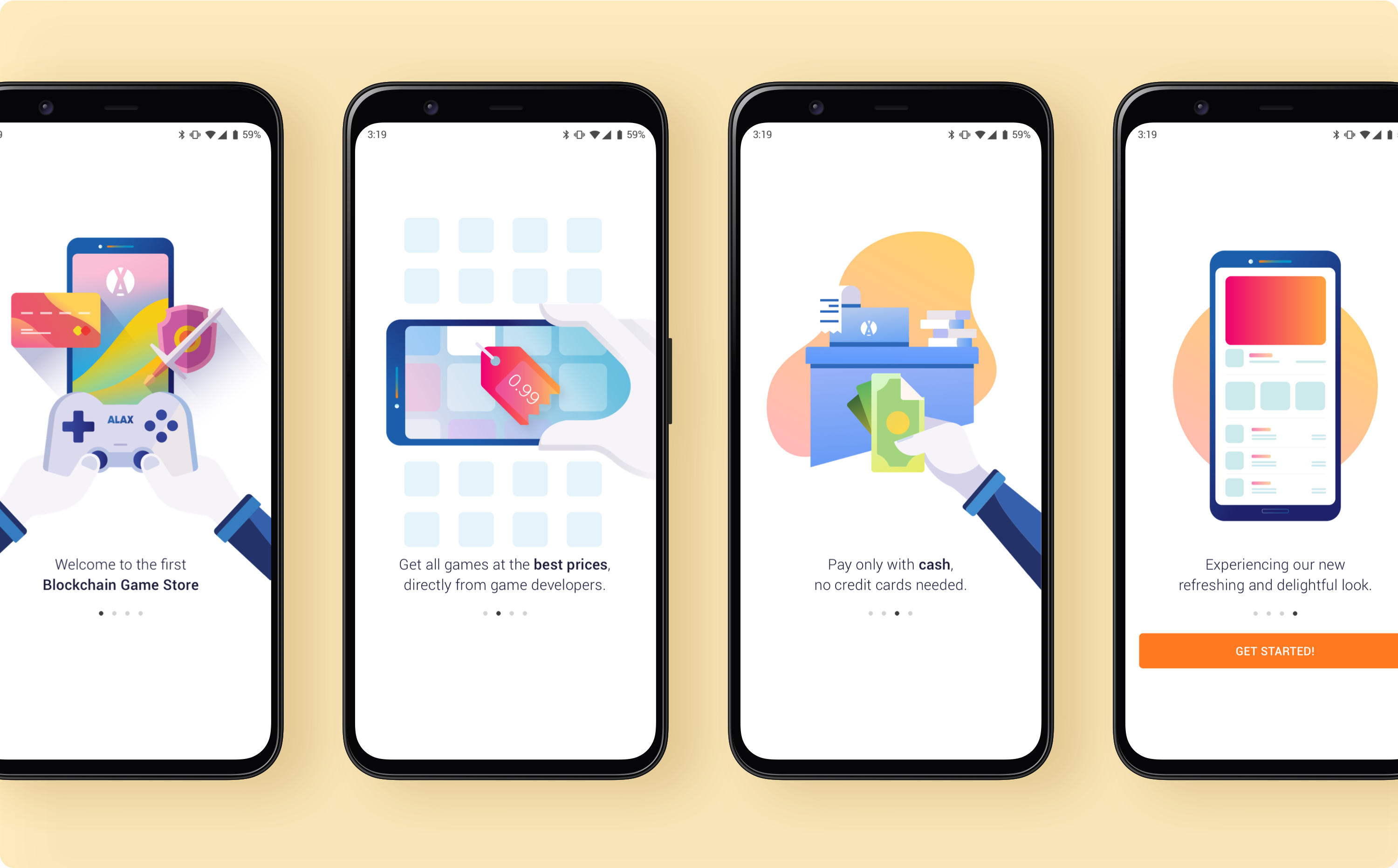
First launch
When user open the app for the first time, they will see the illustrations and short texts describing ALAX’s Store’s benefits that they can get when using it.
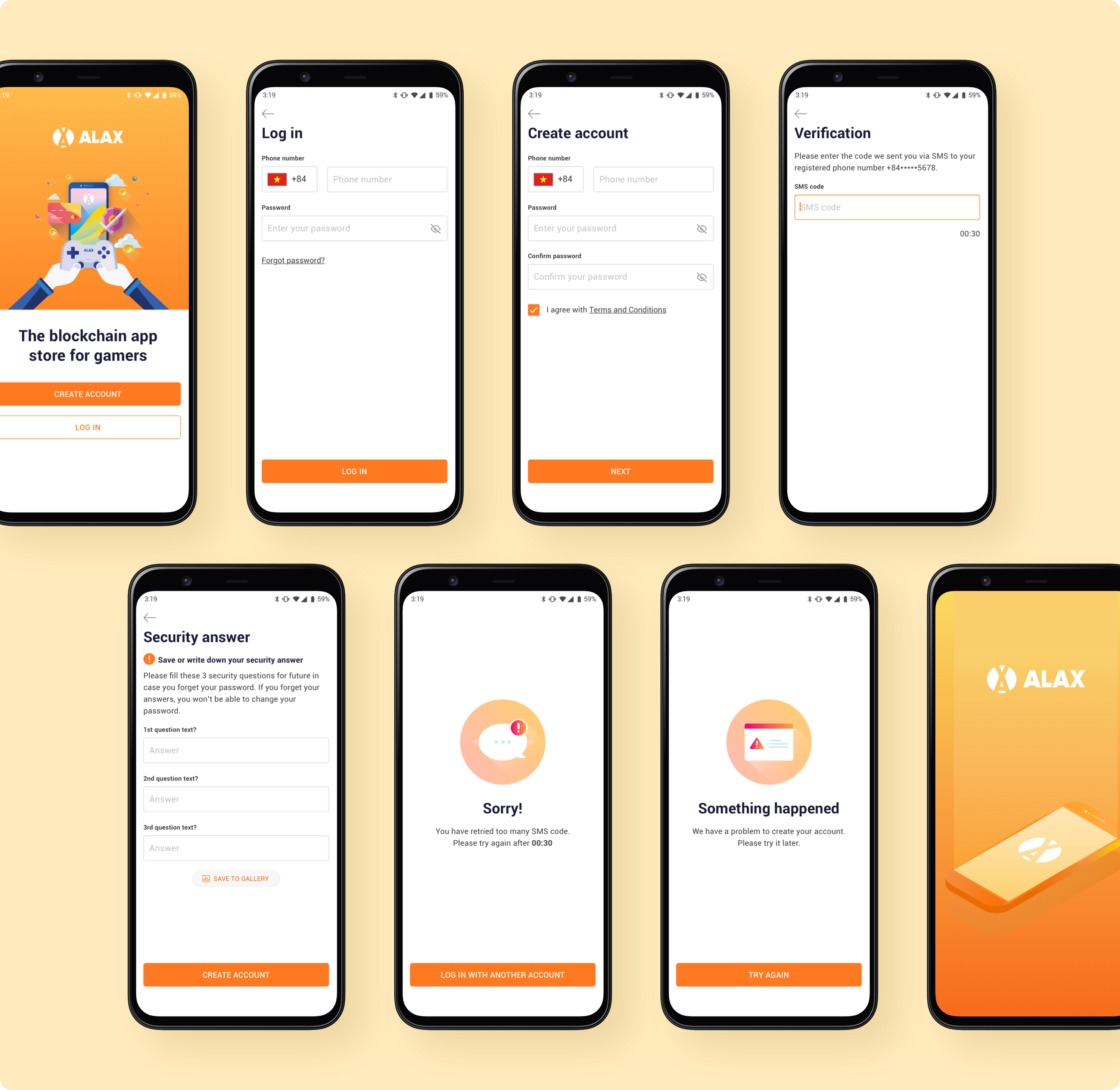
Sign up
At that time, due to security reason, user has to go through 3 steps (Information input, Verification, Security answer) to complete the sign up process. We hope to reduce the steps but still ensuring the security to improve user experience in the future.
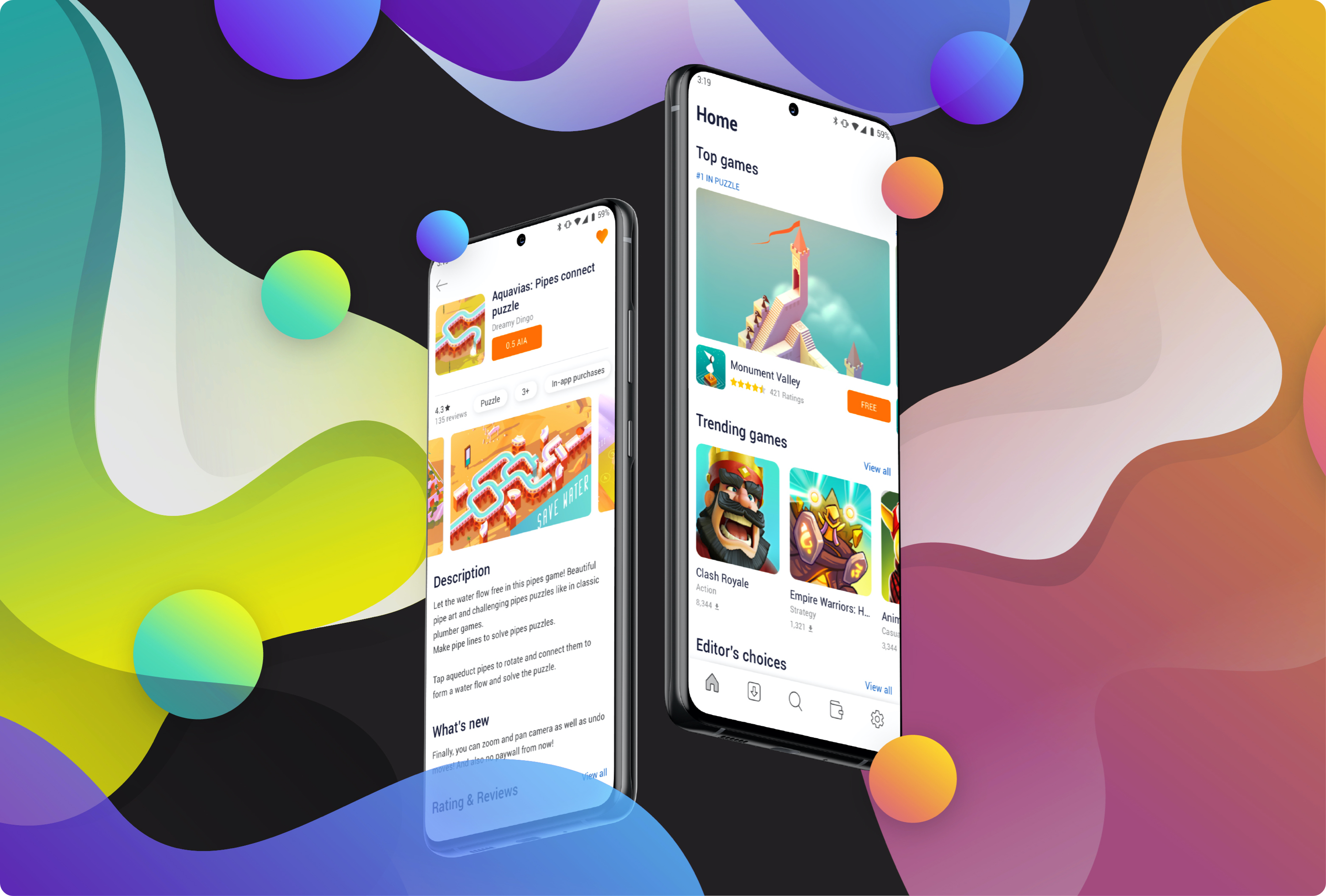
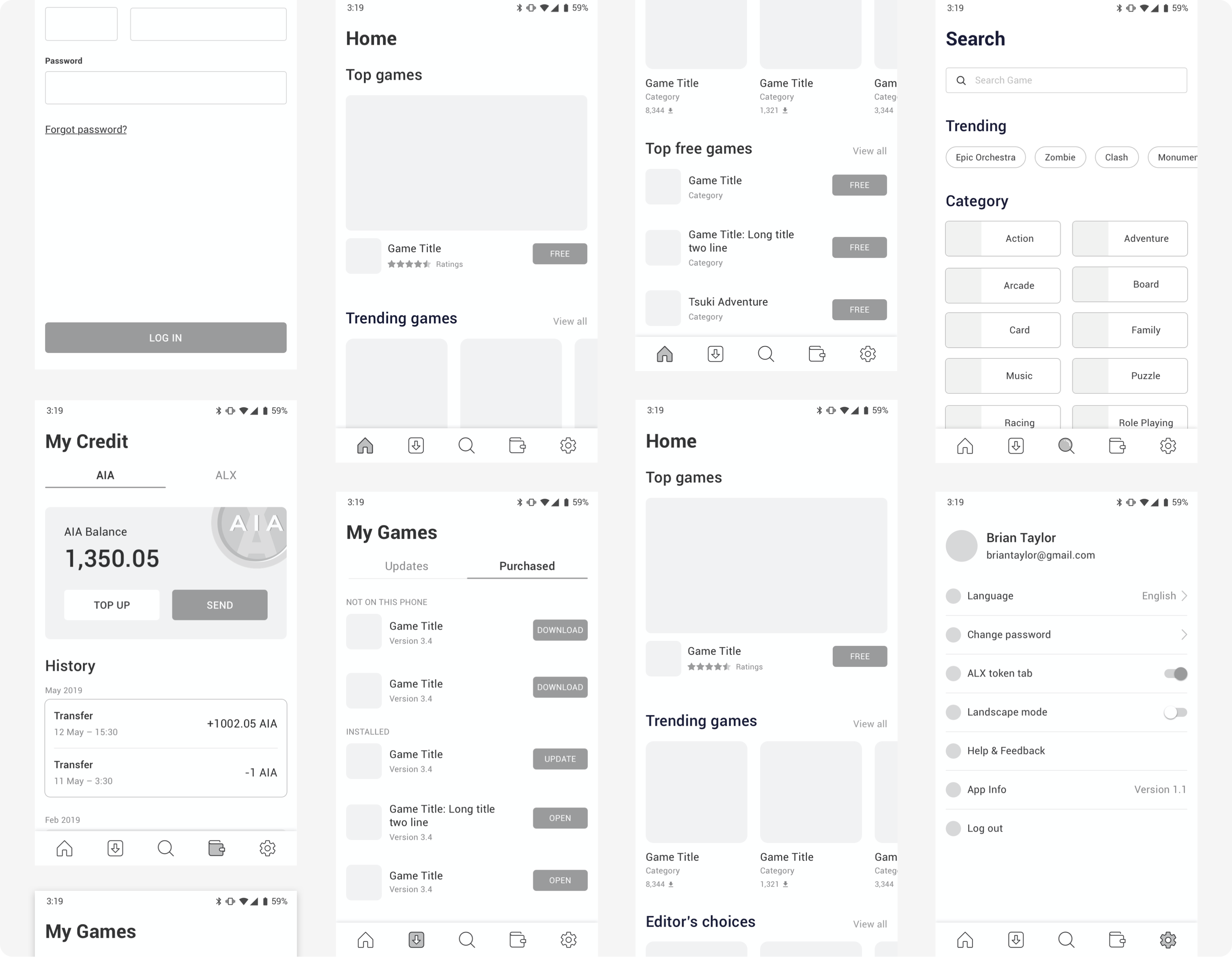
Home
The home page is presented in the order of content priority: Top Game > Trending Games > Editor's choices > Top free games > Top paid games. Higher priority has larger image to attract users. The rating and downloads also are displayed under the title as a sign of the popularity and quality of the game. User can purchase and install the games right on homescreen.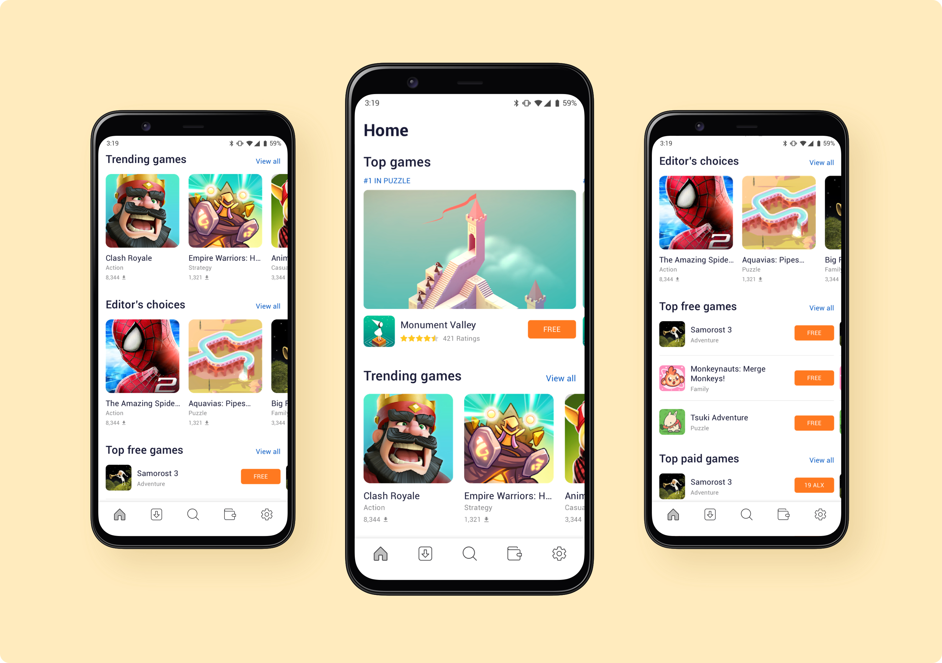
Game Details
In Game details, user can see the screenshots, descriptions, the update's note (What's new) and the ratings. Less important parameters are shown at the bottom of the page. User can purchase, download new games or uninstall games on this screen.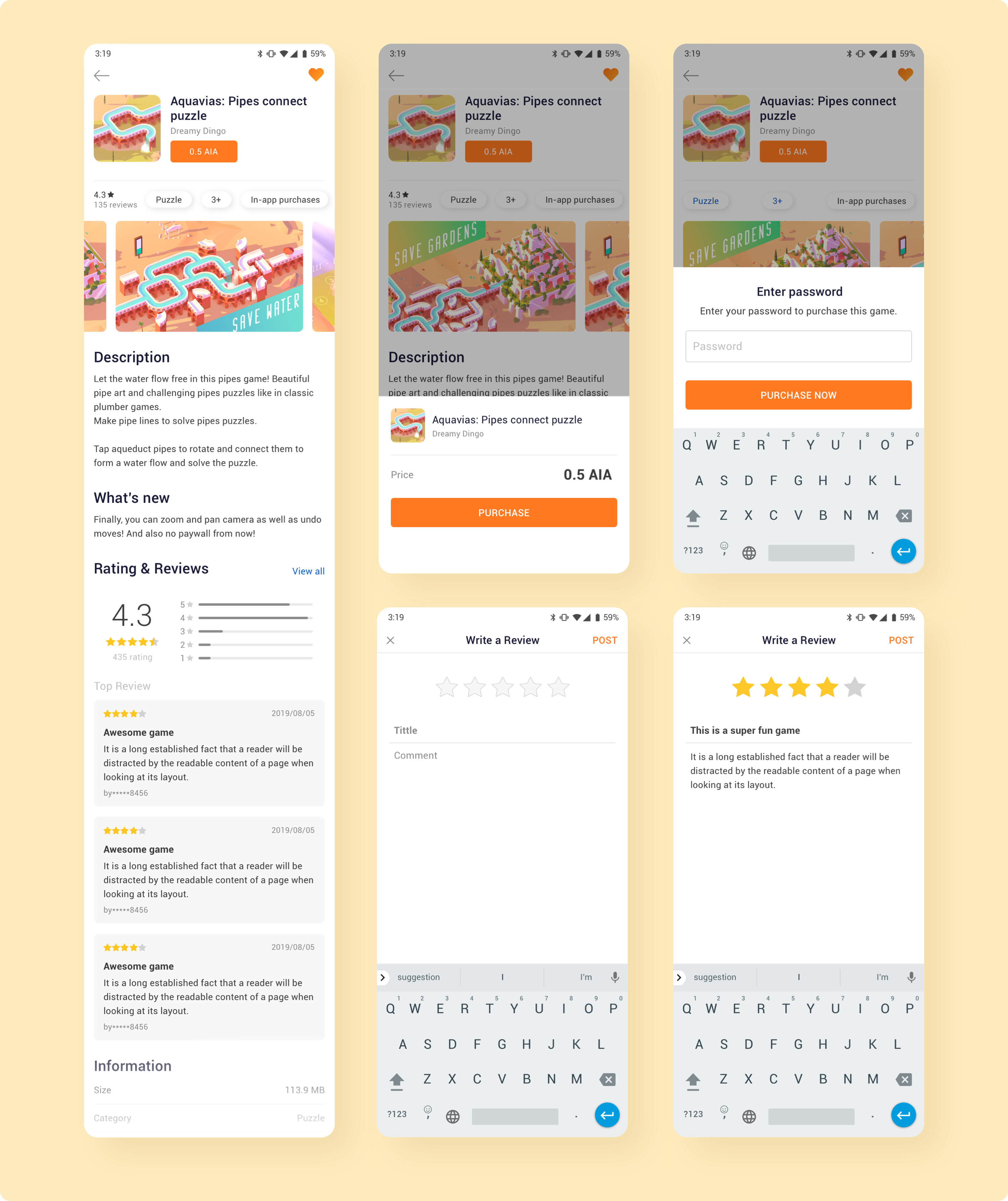
My Games
This is where user managing their purchased games. They can view the update notes, update games, synchronize games on different devices, and view their favorite game list.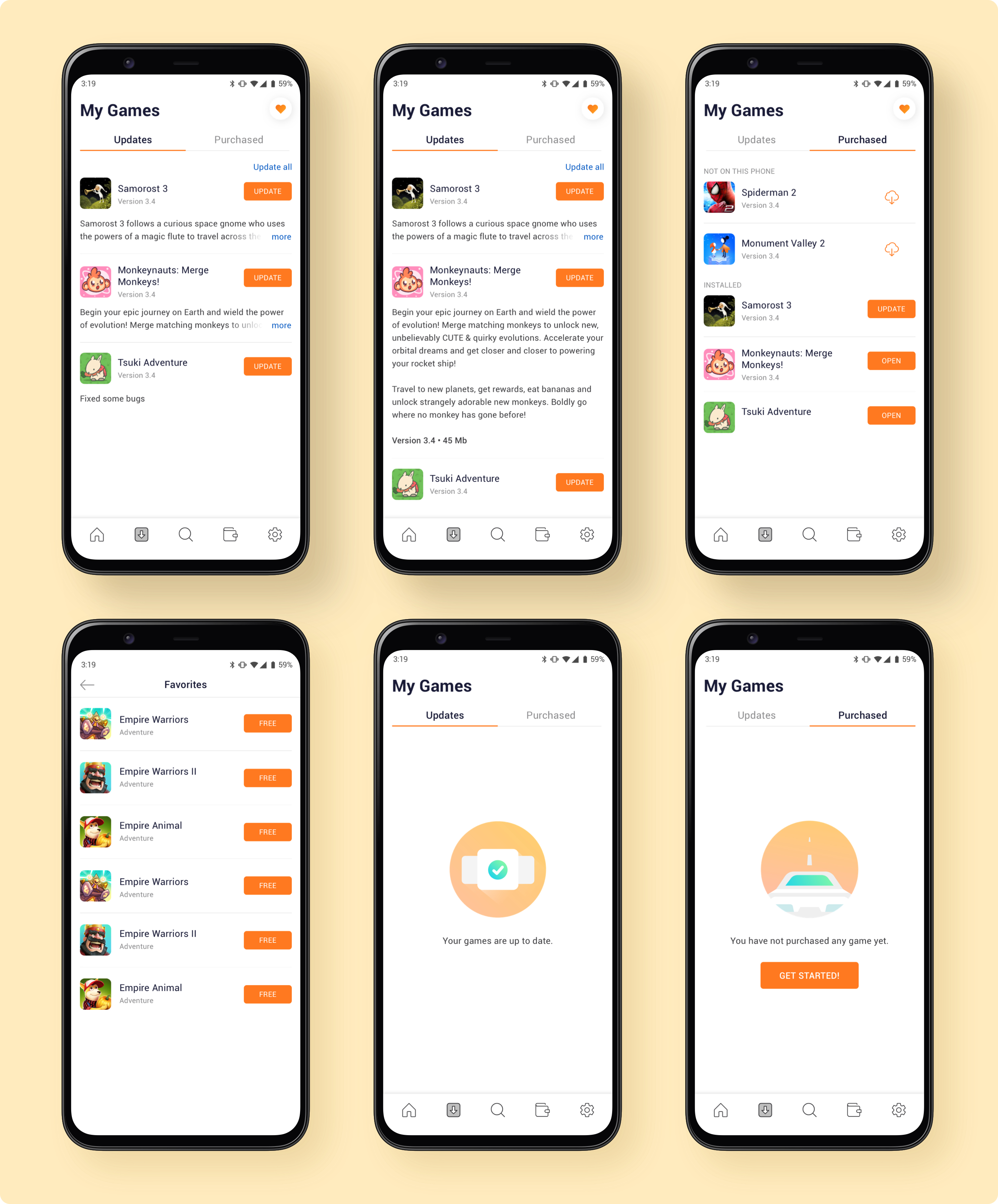
Search
In this screen, user can search for a game by title and also can explore more things with Trending games and Categories. This help increasing the ability of users to exploring and installing new game even without knowing the game title.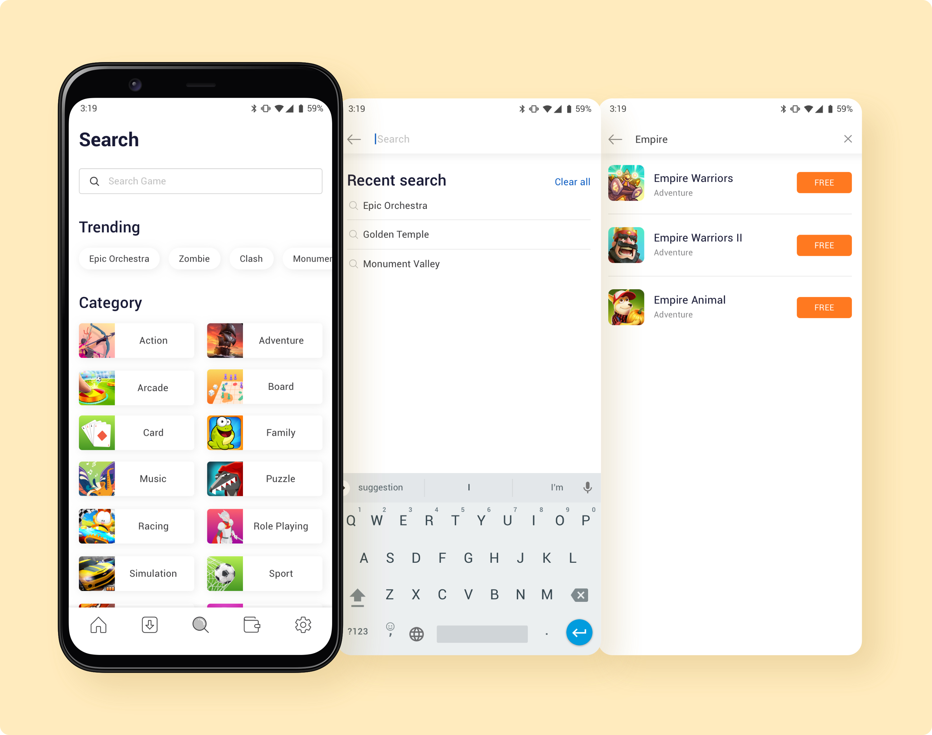
My Credit
This is a big feature in ALAX Store’s. Users can top up, send and receive two types of tokens (AIA and ALX), convert ALX to AIA and use AIA to buy games.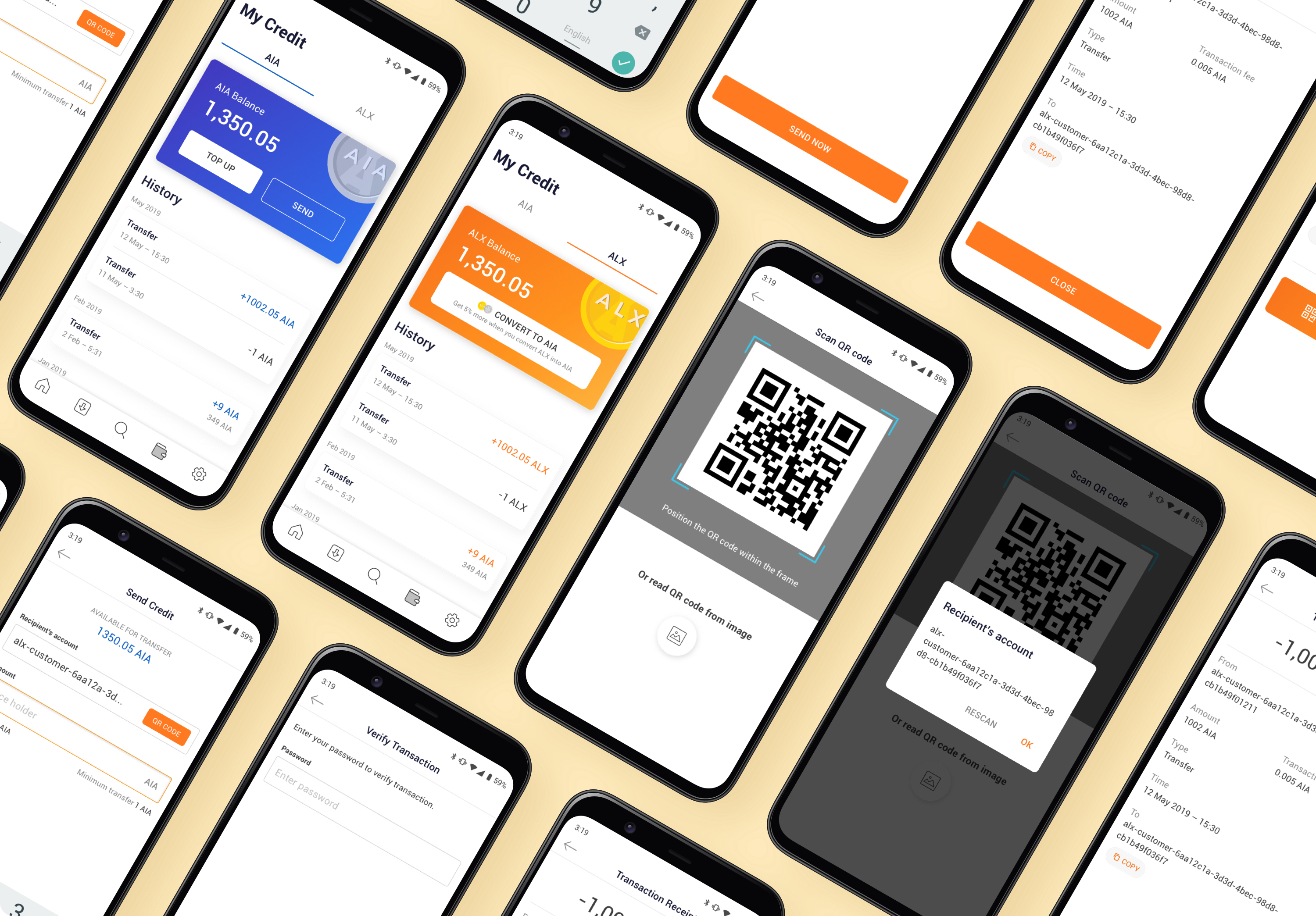
Settings
This is a place for users to change app settings, send feedback as well as logging out.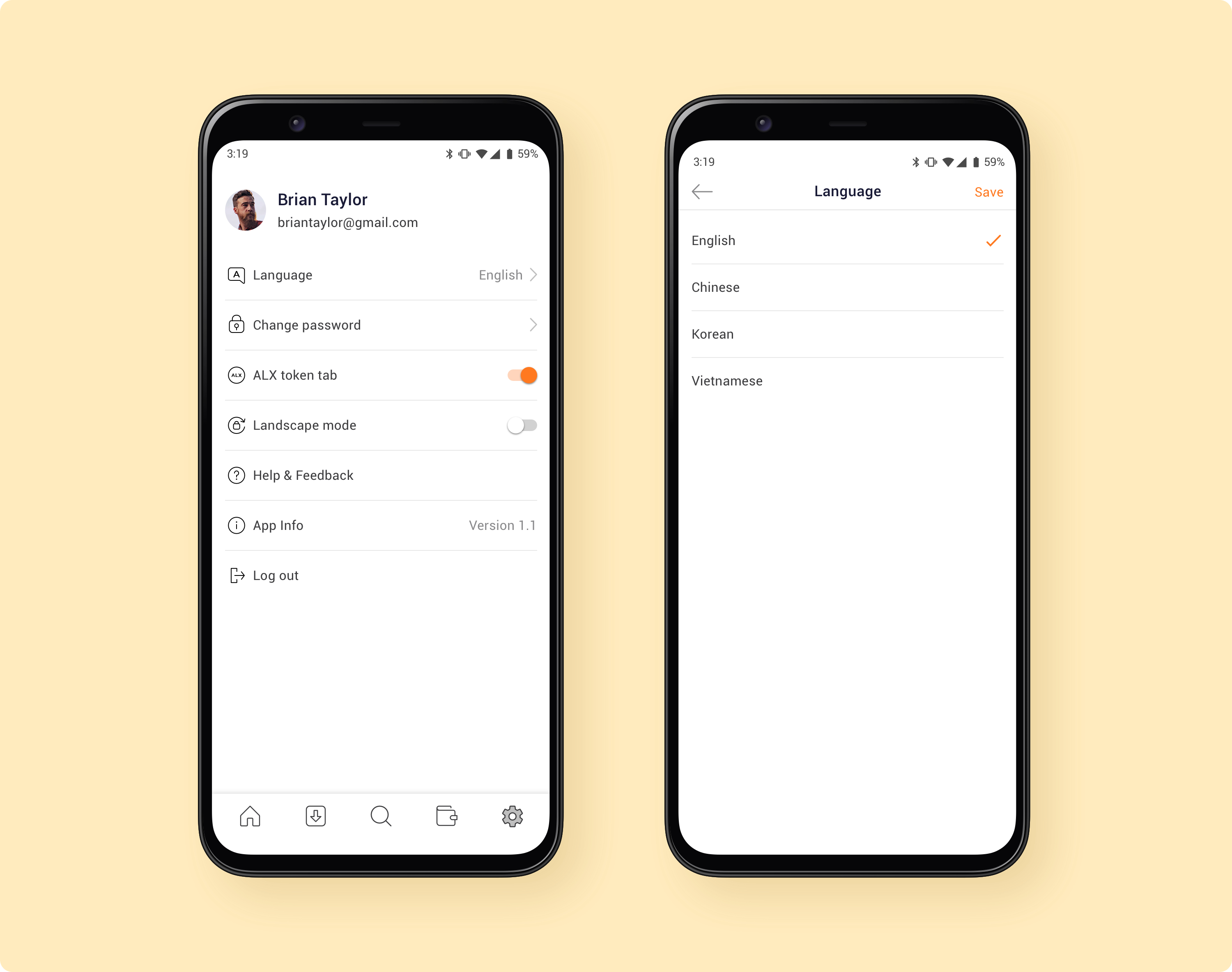
ALAX Store Launching
ALAX Store was launched successfully at ALAX & Partner Party along with other ALAX apps: ALAX Pay and ALAX Publisher. We had received many feedbacks and recommendations for continuous improvement, and we strive to improve our products in the future. ALAX and Partner Party was a great start to redefine the gaming world.

Can you guess who is me? The only one in white!

